
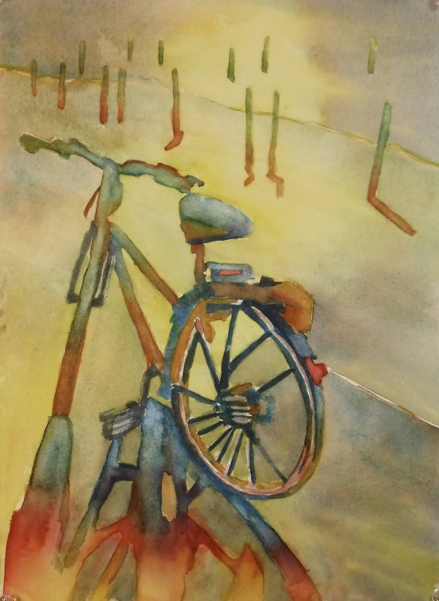
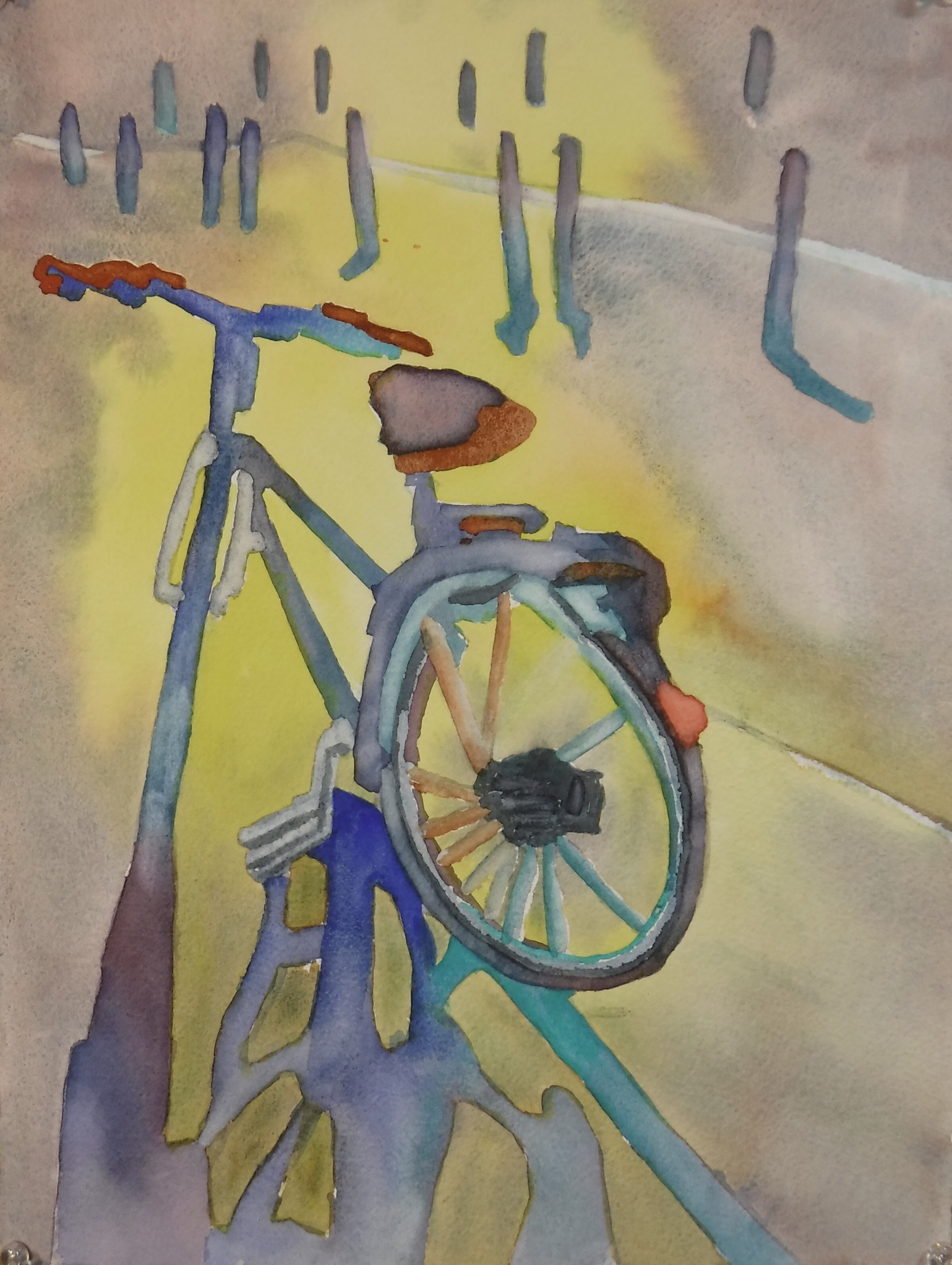
The paper makes a difference - the middle painting was done on an Arches block of 140# rough paper and you get more texture on that surface.


The paper makes a difference - the middle painting was done on an Arches block of 140# rough paper and you get more texture on that surface.


Another small one from the Turner’s Apprentice book demos.
I’ve been doing these on Hahnemuhle 140# cold press paper and think I’ll switch up the paper and see how I like them on something different - but I do like the Hahnemuhle paper and will order more.


These are on a pad of Hahnemuhle 140# cold press watercolor paper I bought to try out. I separated each sheet into 4 smaller sections for painting the sky studies on.

I like the Hahnemuhle cold press paper but would buy a block next, not a loose pad.

Slowly working my way through this book. Some cloudscapes, skies and impressionistic landscapes to come...
March and April should be good months to look to the skies.

I painted the background in a solid Shadow Violet from Daniel Smith. Didn’t like it. So I sprayed a bit of the background off with a strong spray bottle and water. I then added a bit of green for a softer look, otherwise the pale flowers didn’t look good.

Another version - lots of water and messing around in the background before painting the bird in a really wet way.


Evening skies somewhere - not sure where the photo was taken. Not as pretty as I wished but you can practice skies forever and still not get them the way you want - either too blue or too yellow or too red or too purple!! ha ha. Saw the Weather Channel the other day and the weather-man was talking about the stormy purple skies over Nashville, TN. Pretty.

Just a couple of small ones to keep the brushes wet.
On small scraps of paper.


Remember this one - the one I didn’t know where I should take it?

Well, it became this:
Not what was expected at all! ha ha
I got a couple of art books recently, and I want to recommend this one:

Create Anyway: Become an Empowered Artist and Create with Confidence by David Limrite
I purchased the book on Amazon but you can purchase it on his site, too.
I am slowly working my way through the 15 chapters, and so many of the sections seem like he’s right beside me telling me these things after I’ve asked a question or run into a problem in my painting. I found the tone of the book to be more personal than many books I’ve read.
I often read books about the artist’s mindset and process, etc. and come away thinking, okay. But this one has something extra, at least for me. He writes like a friend talking to you who has been there, done that. He doesn’t preach, doesn’t give you rules you cannot follow, and doesn’t teach you techniques. He tells you how to show up and work and what to expect and, in spite of everything, to Create Anyway. Create when your internal critic says you can’t, don’t have time, won’t be able to finish or start or whatever.
I think it would be a great addition to any artist’s bookshelf and I know this will be one of the books I open and read again after I finish the first reading.
An added extra is the online information given at the end of some the chapters - you just type in the URL given and it takes you to more insights, truths, and helpful words to help you create whatever you want to create.
Remember, if you just want technique, you aren’t going to get it here. But you will get something very valuable to all artists. If you purchase the book, let me know what you think.

Another try at portraits. More brush miles = better painting but portraits are something else as far as challenges so...
still blaming Laura!! ha ha.

I’m blaming Laura Starrett for making me want to try portraits again. I just don’t have the light touch and the eyes are always too outlined and dark - and I can find lots wrong with this but...it’s practice and I never practice portraits enough to get really good at it. Wish I could paint them like Laura does - she has a light touch and I have a heavy touch (and how does Ted Nuttall do his splotchy portraits? - would like to try that but not sure how that works with just circles of color dropped in to make the shapes).
Oh, well...another one or two to come - just practice and more brush miles...this one is about 1/4 sheet Arches 140# cold press. Arches and Fabriano are still my favorite papers.

I’ve been picking up some different paper just to get in the mood to do something because I’ve just been standing at the window watching the snow and ice fall down lately!! When will winter be over? ha ha The weather predictors said we’d get 10-12 inches but got around 9 inches total in 2 days - but more coming this week - whoopie!
Don’t know about you, but I am not a snow bunny.

This is not an original but one I did after looking at a painting done by one of my favorite artists, Carol Carter. I couldn’t find a photo of irises but I know I have some - just have to start digging out photos that get buried!

Here is a page of paint swatches of all the dark blues I have now.

(Left the edges showing so you can see how deckled the edges are and how rough it is - this is a fourth sheet.)
This painting is done on Indigo cold press 140# paper and it is very textured. Not sure why I purchased it, but just have a few half sheets to play with for a while. I can see it being used for landscapes and things that work well with the texture.

This one, for comparison, is done on Arches hot press 140# paper. I don’t usually work with hot press but there are some things I like about it.

Maybe a red bird in front of a lovely rainbow sky?

And there’s room for a bluejay, too.


I let it sit a while and then added to it - but not too much.
I don’t hate the finished piece. Sometimes you have to wait and go back to look at it after a rest to see what little it needs.

Spring feels like a long way away...but it’s not. Soon we’ll be seeing crocus, daffodils, forsythia...all those pretty flowers that say spring.

Got some Dick Blick gift cards for Christmas I was saving - then got another gift card from Dick Blick for birthday so I splurged on pigments and paper (Arches 140# cold press sheets).
I was not sure why I ordered the Winsor Newton Indigo since I had Daniel Smith Indigo but in checking the colors, I see they are very different.
So I did a little swatch test of the darkest blues.


Trying to use the minimum of colors/hues and work more with shapes.

Sometimes you don’t know where to take it so this one...um...well, guess I can paint on the back of the paper! ha ha

And no matter how hard I tried to make this into an orange flower with green leaves, it wanted to be carrots! ha ha


This one is on Yupo and I liked the texture when I blotted off some paint with a rough paper towel. (It’s hard to find my favorite Viva Signature style soft towels.)
Again, minimal colors and just playing with texture and shapes.
What are you doing these days to keep yourself painting?

I seem to be getting the hang of just putting color and shapes on paper. I like this one, maybe because it seems very organic.


