Monday, May 31, 2010

LAST WORKSHOP EFFORT


Well, I can honestly say this koi painting is finished! ha ha (I think knowing when to stop and walk away is one of the hardest things for me to do.) There always seems to be just one more thing I can do to it...which ruins it.

Masking fluid is off and it's cropped a bit (mostly from the top and right side), with a few splashes of white and color in there for bubbles...or something.


But it's done. I am learning, still. Everyday is an experiment in water media!


Back to the watercolors for a while: a start on the little painting (painted to fit into some nice square mats given to Jerry by some photo buddies of his - thanks Marion and Maurice). A lily pad and stems of flowers poking out of the water. I need to sharpen up some areas without overworking it...and call it done.


(This is from a photo taken by Doris Glovier who shares her work with her painting friends at WatercolorWorkshop. Thanks, Doris.)

Sunday, May 30, 2010

ELEPHANT WALK + KOI


This is an older piece.

When I returned from the Nick Simmons workshop, I went through my older stuff, looking for something that would lend itself to the fluid acrylics as well as, or better than, watercolors. This one looked possible - a painting started with watercolor on gessoed paper.


I finished it with the fluid acrylics but kept myself from overworking. I like the looseness of it.


It was obvious that there was an elephant lurking in the first watercolor pours and I just brought him out a bit more.


And here is where the Go Fish/Koi painting stands...


I just need to brighten him up a bit and give him some eyes and it will be done.
And what are you doing this weekend?

Saturday, May 29, 2010

1 FOR 3 AND COUNTING

So far, the only painting I've managed to finish without ruining it, is the geisha painting. So that makes me 1 for 3. The canyon painting was a total loss...
and this Undergrowth painting...not sure what to think of it. I have not learned how to bring something out of nothing but colors and drips yet...unless it's obvious to me that there is something to "see" there.


I have worked on the koi painting a bit more (the last one I began in Nick's workshop). This photo was taken while the paper (Arches 140# hotpress) was soaking wet with color and water.

When it was about 75% dry, I spritzed off paint that was still wet, leaving the dried paint (remember, this is fluid acrylic, not watercolor). This is what makes that batik look that adds so much interest and texture.


The problem with the batik technique is one never knows what one will get - kinda like a box of chocolates?? (It's all in the timing.) The fact that you use 140# hotpress paper and tape the edges down without taping the paper down causes those valleys that hold paint, allowing other areas to dry sooner.


Next I'll remove the masking fluid from the fish and begin painting it and working it more into the water.

Friday, May 28, 2010

THE CURE TO A LONG WEEKEND


"The cure for anything is salt water --- sweat, tears, or the sea."
--- Isak Dinesen


Wherever your travels take you this 3-day weekend of ours in the US, be safe, and remember all those who have walked these shores before us.

Thursday, May 27, 2010

I THOUGHT I WAS COMPUTER LITERATE

I thought I was computer literate until I tried out some of the things Nick Simmons showed us in the workshop when we had a day-long PhotoShop tutorial. One thing, I didn't try it right away while things were fresh in my mind. Two things, I have PhotoShop Elements, which is a pared down version of PhotoShop. Three things, I have a little bird in my head (perhaps one of Cindy's kookaburras?) saying, "Get off the computer and go paint!"

So...after 2 hours, I'm whipped, and haven't created what I wanted to create or even know what I'm doing yet. Okay, an hour isn't enough time to learn...maybe another hour tomorrow and then again the next day and in a week...or a month...or a year, I'll get it and be as proficient as Nick was in composing on the computer.


This is what I ended up with - rough but I get the idea of layering different photos to create a new composition. Unfortunately, I've already changed the drizzled abstract too much to use this until another time.


This is what I did with the abstract...going in a more green direction with warms and thinking of undergrowth...it needs some darks here and there and it needs me to leave it alone for a while.


Now off to do something else!

Tuesday, May 25, 2010

SOME LITTLE FITS AND STARTS

Here are all the things (good and bad) that I began in the Nick Simmons workshop. I am working more on all of them (except the wonky building THINK sign which I really have a mental block about = landscapes and buildings = everything I've learned about composition goes right out the window when I try to do a landscape with a building!!)

My little sad geisha, as she began in the workshop...


And after I brought her home and worked a bit more on her.


My wonky building and sign (I won't do more on this).


My abstract made from pulling up the paint that ran down the wall and puddled at the bottom. All I did on this was make some circles where I already "saw them" and then do some pseudo-Asian lettering inside them.


And the canyon pour - beginning in the workshop...and what I've done to it (poor thing - talk about beating a dead horse!!).


Okay, there does come a time when you say, "I'm whipped, time to give up, admit defeat, and stop beating a dead horse." Now is the time for this one.

I'm calling it

Dead Horse Canyon...


You don't have to say a word...I know it's crap to the nth degree - but it's still a learning process, so I'm going to try it again while working a bit on the abstract.

I hope you all are having a good week.

Monday, May 24, 2010

OY! IT'S A KOI!

If you've seen Nick's DVD "Innovative Watercolor" (from Creative Catalyst), you'll know how to do his koi paintings.


But it is so much fun to watch that first pouring of colors, tilting of the paper, watching the paper buckle (a big part of the technique) on 140# hot press paper, that I will just share here his steps we got to see. (Don't you just LOVE that blue and green and yellow mingling like that in puddles of color???)

(The three koi photos are Nick's painting in stages.)


This was painted late the last day and people were missing out who were packing up their vehicles and getting ready to leave while he was working. I began one of my own but had to let it dry in order to pack it away after 5 pm that day so no real batik look to the first pour (but I'll go back to it and do more later).


He was rushing to get this done so the first spray off of colors took it down more than he intended, I think. And he had to use the hair dryer a lot (he does use the hairdryer to push very wet paint around inside the "cells" he keeps separated). See how he pushed the fish down into the water by using a cobalt blue stroke of pure color around its body and then letting that blue bleed up into the body and over the tail? That's what I missed from the DVD (remember, I was watching, running downstairs, painting, running back upstairs, watching, etc...and missed a step, I think BUT I did this by instinct on mine because it just didn't look like it was in the water so...I got it without seeing him do it but was glad when I saw this done because it reinforced the idea that, yes, this is the way to get that fish down in there and not pasted on top).

So...happy painting, everyone! While all these ideas are fresh, I'm going to be going back to the geisha, the canyon and the koi and one other (a total abstract made from dropping a clean sheet of 140# hot press on top of all the runoff from the pouring techniques everyone was doing against the wall!) that I will try to bring out a bit.

Here's the start of my little curvaceous koi that had to be allowed to dry and packed away in the car to take the hour drive home. I'll have to try for the batik look on the second layer in the water.


Sunday, May 23, 2010

FOURTH DAY OF THE NICK SIMMONS WORKSHOP

You're probably wondering, "What happened to the third day?" The third day was spent learning how to compose and create using Photoshop before you even get out a piece of paper. It was full of informative and interesting facts and techniques. But I can't go into that - suffice it to say it could have been a workshop all on it's own and Nick shared how he creates some of his interesting compositions using various photos in a type of montage/overlapping style (and I intend to use this "trick" for my own compositions in the future).

Day Four began with a demo of a simple composition, with Nick talking about drawing and painting buildings that have more personality, using concave lines instead of straight or convex lines. I did not do a good job on my own little "sketch." I never do buildings or landscapes or really create anything without a photo reference, so that's my excuse for doing so poorly. I know it's something I should work on...but there are so many other areas I want to improve in that this will be put on the back burner. I did appreciate what he was trying to do for us and how this took us back to basic composition skills that should be easy to use on every painting (but it wasn't that easy for me). There were about 1/2 the class who benefited from this a lot. As Nick says - you always get a mix of beginners through advanced in these workshops and you have to gear your demos and exercises for all members of the group so sometimes the advanced feel like they are far beyond that while sometimes the beginners feel they don't understand what's being done. It's a hard mix to get just right - maybe like a good martini?

We immediately went into a big, poured painting! A canyon began with a basic contour drawing of the shapes, and Nick poured a gorgeous mix of Quinacridone Gold + Transparent Brown. Yummy colors!


He called this process "Progressive Composition." And that meant, if you had elements of the composition you didn't like in the first drawing and pour, you adjusted them in the second, and third, and fourth pours. Since there were shapes he didn't like in the first pour, he cut in with some lines and cut out with some lines before doing the second pour with Alizarin Crimson. What a bold color!!! But see how some of that gold shows? So you get the first color showing through in areas, the second color pure (where you go outside the first lines) and you have a third color when the first and second layers merge.


Normally, Nick would have painted four layers but due to time constraints he went right into a bold, juicy dark color (a mix of a blue and Dioxizine Purple that is strong!!!). Again, cutting in some areas and outside some areas to adjust the composition even more. And you have the beginning of a canyon painting.

As that was drying, he began doing a little demo of the koi in water (similar to the DVD he has out) for those who wanted to see that "batik" technique up close and personal. I tell you, it's all a matter of timing - he has it...I don't!! ha ha So more practice to get this right for me so I don't wash away all the paint...or none of the paint. Time to get out the timer and see how long it takes for the optimum amount of the paint to stay on the paper with the optimum amount still wet enough to wash away.


This is my first canyon pour...I didn't mix anything in with my Quin Gold so it's pure Quin Gold and I got a bad piece of Arches hot press (see the right edge and those blotches?) that worked out okay on this because it's just more texture. But it took forever to dry and you dry each layer before starting with the next layer. I don't have a photo of the second pour for me but I'll take a photo of where I am on this now (I've worked on it here at home and have something...I think...worth sharing).

Saturday, May 22, 2010

THINGS NOT TO TAKE TO A WORKSHOP

My last post before I left for the Nick Simmons workshop was what to take. This is about what NOT to take:

1. A closed mind
2. A sense of your own importance
3. A feeling that you are too good to go back to basics
4. A fear that you will fail if you try something that scares you
5. No filter on your constant talking out loud, or criticism of others

I've discovered that the best way to not stress in a workshop with about 19 other participants is to be fairly quiet, have a good sense of humor, and bring your "beginners mind" to the task so you are willing to try anything (even those things that scare you, make your feel like you are going to fail or embarrass yourself) - and just keep working on your piece. Most of the workshop participants did just that but there are always one or two...you know the ones...that come to make it all about them. Nuff said!


Now...about that workshop:

Nick stresses individuality in painting (big surprise, eh?)
He said that whenever we see a painting we ask ourselves three questions.


One: Do I like that?
Two: Could I do that?
Three: Would I have thought to do that?

You know that third one is the one where you think, "Darn it! That is sooo cool and I wouldn't have even thought to do that!" That's what makes a painting individual, personal, exciting.

Nick says most people are painting like someone else. You take a workshop and you paint like that instructor instead of just incorporate what you've learned into your own style and personal preferences. But he wants to see something NEW and FRESH and EXCITING. Remember, it's not a good thing to obsess over technique to the exclusion of everything else. It's supposed to be about expression (not how well you can do a sky wash or a pour, etc.).

If you can love the spontaneity and excitement that comes from letting watercolor do it's own thing (pooling, puddling, separating, blending in funky ways, etc.), you can stop working so hard at getting it just right and let the paint work for you. As Nick said, you must "Learn to Love Plan B," because there will always be a Plan B...and sometimes a Plan C and D. I think this was a quote from Sargent but I didn't write it down in my notes who said it first. Sargent did describe watercolor. He said, "Watercolor is making the best of an emergency." We've all felt that panic when things aren't going the way WE want them to go and we forget that we can let the watercolor work for us instead of against us.

So how about pouring? Are you controlled? Do you tape your paper and then with a tiny dropper, drip in that paint where you want it to go and get upset when it strays? Do you spritz and let it run or try to control those runs? That is not the Nick Simmons way.

Nick tapes his painting (predrawn using strong contour lines, not sketchy) on the wall, mixes his fluid acrylics with some water in a cup, and goes for the gusto...


He gives Joseph Zbukvic full credit for coming up with a clear way to describe the consistency of the pigment vs water mix:

Make it like 1) Tea, 2) Coffee, 3) Milk, 4) Cream, or 5) Butter

We poured our pigments and water mix most of the time like coffee or milk and then using a big spray bottle, would spray off some areas and make more drips in areas, allowing the paint to run down the paper. You should have seen the wall (covered in plastic) and the area under the wall (with a large sheet under it and also covered in plastic). You could not do this if you were timid, wore light clothes you didn't want to get messy, or just were afraid to let go. I tell you, it pushed me because I was a timid thrower of paint - but I really wanted to do it and will do it again when I clear out some space in my house for this.

Although Nick put this away and did another, he was showing us how to do it and we all got a chance to do it with our colors - less is more, don't go with too many different colors, just make it your own. And then we used that as a background for what came next = actually taking the brush and painting on the paper.

We all did full size sheets and they looked okay in that big workshop area. He worked on 30 x 30 squares of watercolor hot press paper, taped all the way around and with a bead of masking fluid around the tape and paper - as well as masking fluid in various areas of the drawing to maintain whites at the end. He says every painting has it's optimum size and it's up to you to get it to it's "fighting weight" where it looks the best. The size of the painting is often the first thing he thinks about.

And we did a geisha painting using Kanji lettering (no one, not even Nick, knows what it says or doesn't say, they are just being used as a design element).


You can see the only pour Nick did on this to use as a background/design element. He said he wants to work with a more muted palette of colors now so he uses more subdued, warm colors in the pour. When that dries, he begins actually painting in the areas, working with keeping the paint wet in areas where he works - he calls this "cell painting" and it's how he can get that loose, watering, out-of-control look in areas without actually losing control. If you start with more intense, colorful pigments than you'd normally start a painting, you can knock it back later with darks and more muted colors. He is working with a more limited palette, using "jewel tones" of bright, pure pigments in some areas left white when he finishes the painting.


You can work wet-in-wet in specific areas, using a variety of colors to get your tortoise shell hair combs and her dark hair and clothing. There are some large letters masked out and some whites in her hair here. Her lips and the whites of her eyes were also masked out before the pour. Keep the paint wet by touching water into the area, not brushing and brushing it. You can keep it wet with clean water or drop in another color before it dries. If you let it dry a bit, then drop in clean water, you get lots of texture and variety of shapes inside the shape.


When the painting is where you want it, you remove the masking fluid and paint the lips and eyes, working on bringing up some color here and there, seeing if the whites in the pour (in the background) work well or if you need to drop some color in there later, etc.


And the finished geisha was purchased by Karen at the workshop. She said it would look perfect in her bedroom that has other Asian art decorations in it.


This is my version of the geisha, using colors I had and liked, and starting with the pour as the drawn and masked paper was taped on the wall. We all used the same black and white photo and then just drew our ladies out freehand - which is why each painting looked so different. We also each placed out Kanji letters in different places on the paper.


I haven't removed the masking fluid from the hair yet because I think I'll darken it in areas, and I modified his "sewing machine stitch" technique for a more organic look on the extra lines to the right of the painting. He shows you how to do this in his DVD of the koi painting, wetting the paper and then dabbing in pigment along a line that isn't too wet or too dry - and letting it bleed out a bit. He does this to keep from getting a cut out and pasted on look to the painting which acrylic can have. We did this as an outline of the drawing, for her face, hair, clothing, etc.


I sent Deb Ward photos I took of her painting so I hope she shows it on her blog!


Each painting we did in the workshop was on 140# hot press watercolor paper - Nick doesn't use anything heavier than #140 because he likes to move and tilt and help that paint run and flow in most of his painting styles (this one was more controlled than the koi fish paintings where he wants the paper to buckle and dry at different stages). And he uses hot press more than cold press (although he uses both). He buys his paper in rolls so he can choose the size - and often works in a square format.


And that was just some of day one and two. There are things I'm not going to tell you so you will be surprised and perhaps be tempted to take a workshop yourself. My recommendation is, if you do take a workshop from Nick, do get a beginner's set of fluid acrylics (either Da Vinci or Golden), wear old clothes you don't mind getting painted, and take your beginner's mind with you - oh, and prepare to laugh a lot.

Monday, May 17, 2010

THINGS TO TAKE TO A WORKSHOP

The List:

Full sheets of watercolor paper (cold press and hot press)
Pencils for sketching
Tracing paper and Newsprint
Photos you can work from later in the week - and have some on CD for Nick to manipulate
Fluid Acrylics in a variety of colors (from Da Vinci and Golden)
Older brushes (don't use your good watercolor brushes for acrylic painting)
White acrylic gesso


A water container
Paper towels and rags for wiping up when we pour, baby, pour
An apron (to keep the mess off my clothes, although I'm wearing old clothes in the workshop)
Masking fluid and artist's tape

A large plastic butcher's tray with freezer paper to wrap over it (so the acrylics don't dry on the tray and ruin it for watercolor).

Don't forget to take your camera so you can get lots of shots of your paintings and Nick working throughout the week!
Deb, Sharon and I are sharing the list, each one being responsible for bringing enough for all of us to use during the week. I'm already getting anxious and nervous and excited!!! Today's the day we start but I won't post until I return home. Each day from 10:00 am to 5:00 pm I know we'll be put through our paces, being pushed and pulled in new directions...and, hopefully, we'll loosen up, have lots of fun and learn a lot we can take back home with us.
Check back in Friday to see posts about the workshop.

Saturday, May 15, 2010

DON'T BE KOI, NOW

Bill said to hurry up and paint those fish - he said it twice so he must be on the edge of his seat, waiting for them to arrive - so...


Here is the start of them. I'm not sure how I'm going to make them look like they are IN the water with parts under the water. I may just run a thin wash of cobalt blue over everything after I get it all done? Hmmm...


I won't get them done before I drive over to meet Deb and we go up to Dayton for the workshop (looking forward to meeting Mary Sonya there, too!).


You'll just have to be patient, now, Bill - I know it's hard for you but be good until I return.


I did finish the Lemons and Shadows painting. It just needed a bit of shaping on the lemons and done!


Friday, May 14, 2010

BATIK LOOK BUT...


I started this by putting the first bright colors on the leaves/seaweed and then waiting a while (not sure how long - I really need to time this and write down how long it takes)...and spritzing them off (leaving just the paint that dried and removing the paint that was not set).


So I finally got the look - but removed a lot of the paint. No worries...


You just reapply paint, going a bit darker and duller in color to tone down what is left of that bright green - ouch!


Unfortunately, it still looks too

GREEN

for my taste (the photo is NOT that bright lemon-lime green but is warmer than this looks BUT still pretty darned green).
Oh, well, not going to panic (yet), but will remove the masking fluid on the koi and begin on them before deciding what to do with the leaves/seaweed.
No one said this was going to be easy...right? Don't give up on me yet...I think it can be saved...maybe...I hope...

Thursday, May 13, 2010

KOI POND A LA NICHOLAS SIMMONS

My memory is horrid! My television is in the livingroom upstairs - my art room is downstairs. I watch a bit of the DVD, then go down and start doing the next step...and forget the next step! Of course, a LOT of time is spent waiting for the paper to dry to a certain stage and as damp as it is here, that's taking about 45-55 minutes each time.

These next few steps are (see previous post for steps 1 - 6):

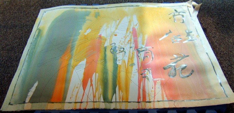
7. Using a strong mix of Ultramarine Blue + Dioxizine Purple (more blue than purple) on your palette, you then brush on the color, wetting it well and tilting the paper again to let it blend and merge with the other colors. (You could pour this mix if you prefer). Blot up the color where you want to show the underlying color more (the Phthalo Blues and Quin Golds and Raw Siennas).


8. Make water drops after this has dried a bit (sheen is off the paper and it's about 75% dry). Then spritz off the paint if you want to create more batik effects (at this point my paint had dried too much to make water drops or spritz but I have an excuse = I was having a horrid migraine so left the painting sit too long).

9. After the last colors dry, mix up a bit of Raw Umber + Ultramarine Blue on your palette and, using a tiny brush, you'll make rivulets on the paper. You do this by 1st putting clean water in the brush and smooshing it on the paper, making runs of clean water - then you take the pigment in the brush and touch it, allowing it to run and create some more interesting looks. You can blot up the runs if you don't like them and you can just paint them in but be careful you don't go too dark. Pay attention to the background color and make the rivulet colors fit in with that.


10. When everything is dry, remove the masking fluid from the leaves/stems only, leaving the fish covered. Then reapply masking fluid around the edges of the tape and let that dry.
At this stage, you are ready to mix up some greens and golds and blues and browns on your palette and start painting the leaves/seaweed stuff. Nick says he likes to use bright colors first because you can tone/mute them later but can't brighten up dull, dried acrylics. So start light and bright with your color choices.
I'm hoping I'll get some time to work on this later today and get the leaves/seaweed done - but I have cleaning to do (seems like I just did this last month and it needs it again! ha ha)
I really recommend this DVD to learn this technique and learn what a good teacher Nick Simmons is - he is very relaxed and it's like he's just standing in front of you showing you this painting style. So far my only nitpick is my own fault = I haven't been able to create the batik look he's trying to teach me! Next time I may use a hairdryer and dry areas so I know there are dry and damp parts of the paper to work on to get the batik look.

Wednesday, May 12, 2010

NICHOLAS SIMMONS DVD

I've been revisiting my Nicholas Simmons DVD from Creative Catalyst called Innovative Water Media, it is my second introduction to Nick's "batik watercolor" technique using fluid acrylics (although, at this point, he hadn't worked with Da Vinci to come up with all the fluid acrylic colors and had to use thicker bodied acrylics watered down for some colors).


I watch a bit of the DVD and then copy the technique, trying to get some of the same great looks Nick gets. I haven't been very successful yet. That technique of waiting until the paper is dry except for the valleys where paint is still wet and then spraying off the paint in a forceful spray isn't quite working for me - it's all in the timing and I either get impatient and do it too soon, or forget about it for over and hour and it's too late.

If you've never tried the fluid acrylics, I think this DVD will take some of the fear out of them for watercolorists who like to know something "bad" can be lifted off. I am enjoying the fluid acrylics now - not being too keen on them my first few experiences - and am looking forward to the Nick Simmons workshop I'll be attending in the Dayton, OH area next week!

Anyway, here's where I am so far while waiting for another layer to dry completely before moving on and taking another photo.


1. I masked off the edges, running a thin bead of masking fluid (Pebeo Drawing Gum) around the edge of the tape where it meets the paper. Nick says this keeps the paint from running under the taped edges, leaving you a nice, clean edge.


2. I drew my koi (using photos taken on a visit to St. Louis) and seaweed/leaves on the paper.


3. I wet the back and front of the paper until it was soaking and then began by pouring Raw Sienna mixed with water in a cup onto the paper, tilting and moving it around on it's own (no brush touches the paper yet).


4. While the paper is still wet wet wet, I poured on Phthalo Blue mixed with water in a cup onto the paper at the bottom edge, tilting and moving it around and letting the colors blend.


This is the way Nick begins but he's using thicker bodied acrylics at this point so his colors are darker - and I may have thinned my fluid acrylics down too much but it's better to be lighter than too dark at this point.


So...two pours of two different colors.


5. While the paper is still wet (it's wet almost all the time you're working it), I poured a bit of Quinacridone Gold mixed with just a bit of water in a cup onto the top portion, letting it run and tilting the paper to blend it.


6. When this was almost dry, I put in touches of Quin Gold or Raw Sienna here and there and spritzed it out so no hard edges.


I'm just following the DVD as Nick does it. But his looks so much better at this stage than mine! Guess that's why he's giving the workshop - not me?!?

It's a messy process so I have a large pan at my feet that catches the drips as I tilt the paper and let the paint run off - and I have a nice towel to wipe up all the extra (except the part that gets on the backs my forearms! ha ha)

When this stage is almost dry - about 75% dry, according to Nick - which means it's dry except for some of the areas that were puddles when you put the paper down - then you create blossoms by dropping in clean water. It works pretty well if you catch it when it's not too dry and doesn't have a sheen on the paper (meaning it's still wet). Working this wet-in-wet over and over again really saturates your paper and it's a damp, rainy day here so gauging the drying time is a bit tricky. And once the water drops have dried a bit - but not 100% - you take a strong spray bottle and spritz off some of the paint that hasn't dried, creating that "batik" look of the thing. This is the hardest part for me to get right and so far, I haven't done it right. But that's what practice is all about.


Tuesday, May 11, 2010

LOCKED HEART


I worked a bit more on the fluid acrylic painting I began in Deb Ward's workshop a couple of weeks ago. I'm shy some colors Deb let me borrow - particularly the Cerulean Blue - but am making it work, taking my time and doing a little here and there.
What do you think?
I think I have to be more careful to get the grain of the wood in a straight line from top to bottom (some of the lines seem to be slanted inward. It's not finished yet, but I'm pretty happy about the colors and the rusty bits and some of the blues. With acrylics, I think you could continue to work on it for a long time, just doing little things, but at some point you have to call it quits...which will be soon on this one.

Monday, May 10, 2010

LEMONS AND SHADOWS - ALMOST DONE


I tried to get the colors richer by adding more reddish tones. Almost done now - except for the lemons, which need a bit of work to get them looking for rounded and shadowed. (The blue is more a grey-blue muted color than is showing in the final photo - my camera likes blues but tends to make them more cool than I see them).


Thanks to all those who stuck with me through the progression of this one!

(Funny, Sandy Maudlin mentioned that the yellows would love cobalt blue - and I had already put blue on the bowl when she sent me that email! I guess she was my teacher for so long - 6 years - that I know what she'll say before she says it to me! ha ha)

Have a great week!

I have plans to finish the fluid acrylic paintings I began in Deb Ward's workshop. And then revisit some DVDs, especially the DVD by Nicholas Simmons to get in the groove for his workshop coming up the 17th-20th of this month in Kettering, OH. I have my place in the workshop and a place to stay so I'm ready!