Thursday, April 29, 2021

SWEETPEA


 Trying to show the light hitting the flowers.  Did not like the bottom so cropped it off.  I like the granulating of the colors I used in the light blue-green (cobalt teal + ?) and got some light.  Started another to see if I can do better.


The start.  Will go in the background more after I get the flowers the way I want them to be.  Darkening some areas later.


Tuesday, April 27, 2021

TINY PAINTING FROM LARGER PAINTING


Just a little scrap piece cropped from a larger painting - added the cabin by the lake.  Bookmark size.  

Sunday, April 25, 2021

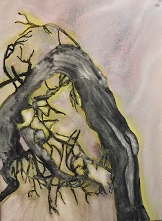
TREE


An old weathered, scraggly tree found during a walk in the cemetery last week.  

Friday, April 23, 2021

FIELD WITH COWS


Just outstanding in the field.  


Monday, April 19, 2021

GLAZING


Glazing color over color and trying to stay light.  Another “copy” of a painting in a book.  Had not done any glazing for a long time.  There used to be a prominent artist who was famous for glazing her scenes = was it Catherine Anderson?  Can’t find anything about her now.

I never had a patience to work this way - a lot of time spent waiting for the first layer to dry, then paint and wait for the second layer to dry - and I’ve heard of some artists who go as many as 15 layers??  


Saturday, April 17, 2021

SIMPLE


 Simple take on a painting in a Jeanne Dobie book.  Changed colors but basic shapes the same.  So just playing with whites and seeing what goes well with the dark green I used for the background.  


Thursday, April 15, 2021

BACK TO TURNER STUDY


This began as one painting.  But, in the Turner book, you needed to tape off the middle once dry and then spray one side to get more misty-looking work.  It didn’t quite work for me - maybe I used pigments that were more staining the ones in the book - so I made two different paintings out of the whole after cutting down the taped line.  


 Love the way the sky happened on this one.  Sometimes the pigment and water just do their thing in the right way and it’s best to leave it alone.  


Tuesday, April 13, 2021

CAW GIRLS DEJA VU


A few years ago, I was painting my Caw Girls series of paintings.  I found this first one that needed more work so painted and shaped a bit of that.  But wasn’t that happy with the outcome so...

Do over.


But this time, it looks like instead of a crow on her hat, it’s a raven because it’s so big.  

Still works.


First painting = Jester’s Pet/Caw Girl series

Second painting = Darkness Loves Company/Caw Girl series


Both are on 1/2 sheet Arches 140# cold press paper.


Did these before starting the Turner’s Apprentice book and exercises.


Sunday, April 11, 2021

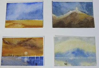
A LOT OF SMALL PAINTINGS IS GOOD PRACTICE


These are very small - one of the things the artist leading the Turner’s Apprentice demos/exercises says is that it’s more important to paint a lot of small paintings than a few large ones.  So we are told to tape off a sheet of paper (I used a block of Arches 140# cold press) and did 4 on each sheet.  I liked the one I enlarged at the bottom the best, using lifting with a razor to get the whites, lifting out the sun and reflection with clean water, and adding the darker reddish clouds on the gold-red sky.  


Friday, April 9, 2021

A MOUNTAIN CASTLE?


Painted this one first.  Then decided the left side didn’t do much so...cropped it off.  And look at how that changed the way my camera showed the color?

I also went in and took off some color in the “castle” and added some windows by just scraping off the color with a razor blade knife and leaving the white windows.  Muted some of the greens down, too.  

Not sure I did myself any favors by continuing to fiddle with this one.  


Wednesday, April 7, 2021

NOW WE’RE TALKING COLOR


Back to my regular color palette.  Still working through the Turner’s Apprentice book and enjoying the demos/lessons and suggestions on brushwork.  

These are both small - 1/8 sheet Arches 140# cold press paper.  


Monday, April 5, 2021

WATERCOLOR GRAPHITE


The color in the Japanese watercolor/graphite palette is very muted but you do get some color - esp. that reddish black!  I can see taking these out in the field and doing pre-lim sketches.  Nice quality.

Saturday, April 3, 2021

THE LAST FEW MONOTONES BEFORE COLOR COMES TO TOWN


The last three small monotones before I start in with the muted color from the Japanese palette of watercolor/graphite mixed colors (like Derwent graphitint colors but less expensive). 


The paper makes a difference - the middle painting was done on an Arches block of 140# rough paper and you get more texture on that surface.