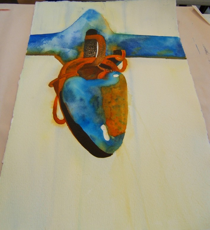
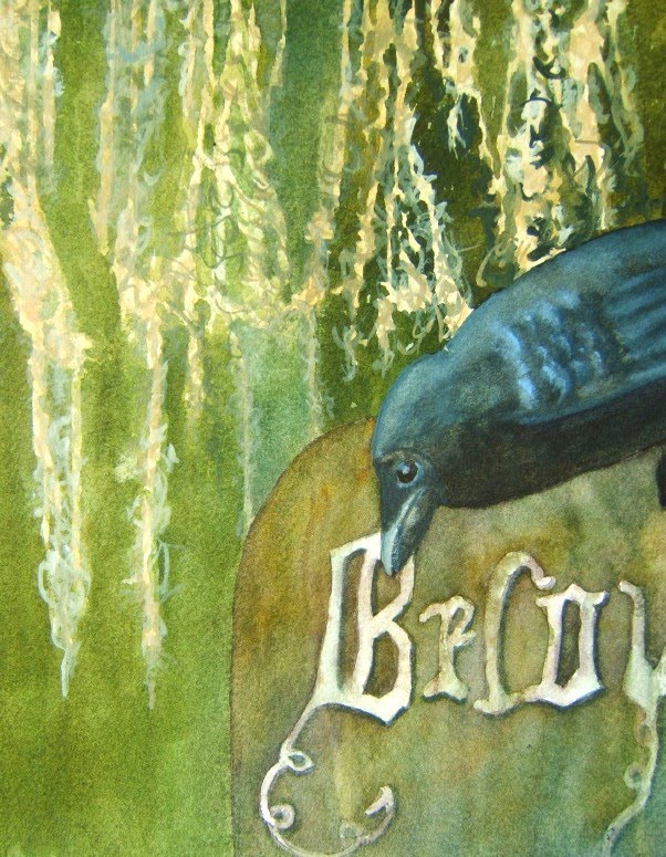
I was too tired last evening to post anything. I took my camera the second day but only got one good photo before my battery died and I didn't have an extra set with me. So had to buy batteries on the way home and take a photo of what I had completed in the workshop both days.
Yesterday, I took the "scenic route" to Deb's, traveling more on Route 1 and seeing the houses, farms, redbuds blooming, dogwoods coming out white against the green of the trees. Saw a huge, healthy hawk sitting on a fencepost so close to the road I could see the individual feathers on his chest! Good thing the speed limit was 45 because I just took my time and enjoyed the drive. The sun peeked out from the clouds once in a while but it was drizzling again by the time I got to Deb's (and I'd wanted to take a photo of the sheep and goats at the farm before turning onto Deb's road).
Anyway, the day began with us picking up our watercolor boards that were prepared and drying. (The evening before we left Saturday, Deb passed around white gesso and had us take our fingers and dab gesso on the edges where the paper has a tendency to pull away from the board. She said this will keep that from happening if you paint really wet-in-wet on it. I'd always taped the edges before but this worked and I'll continue to do it.)

I hadn't chosen a photo to use or done a drawing so spent an hour that morning doing that, getting my drawing on - I didn't do freehand because of the intricacy of the flower so traced on tracing paper and then put Saral graphite paper behind the tracing and traced that onto the watercolor board. Then I rubbed a kneaded eraser over the paper, lightening the Saral which tends to be too dark for me.
So I was ready to go and worked less wet this time, pre-wetting just the areas I wanted to drop paint into, so worked bit by bit and tried to get some good variety in the greens of the leaves. I worked paler than I normally do, too, just taking my time with the colors and values.

The painting was from a photo taken at the St. Louis Missouri garden my Sweetie and I toured (last year?) during that horrible 102F heatwave - I think it was in June. Walking through the Asian-inspired areas, you came upon this huge pond and the number of lotus flowers blooming in this huge pond was overwhelming - one of the most beautiful things I've seen.
I finally got to a point where I couldn't stand the white background any longer, so wet it all around and dropped in Ultramarine Blue (which exploded in the water like blue fireworks) and Hansa Yellow and toned it a bit here and there with Raw Sienna. Then I went back and darkened and shaped some of the leaves and a touch here and there (with Titanium White - yes, you can use white in acrylics!) on the tips of the petals.

Here's a close-up of this one...
When I'd get to a point where I wanted to walk away from this one, I'd go back to the heart lock painting and I tried to tackle that wooden background that had to be drybrushed. I used just Hansa Yellow Light, Quinacridone Gold and Ultramarine Blue for the wood, and tried to do it with a bristle brush, keeping things dry (except for that right top which got a bit green and wet).

I still have work to do on this one (push some things behind other things with the rusty bits, maybe darken some of that blue of the metal, work on the whites I still have, and do a tad more on the drybrush background that is supposed to be wood - it needs the lines running down that are the separations of the boards).
I consider the lotus blossom finished.
I was putting things away and realized I had another 1/2 hour or so...so got out a fresh piece of watercolor paper (140# Fabriano, I think), and took a stencil I'd bought from Mary Beth Shaw (she's making them now and selling them), and just took the left-over paints on my plates and used that to create this - fun!
Everyone said they already saw a garden in this. I'm not sure what I'll do with it - it's pretty just as it is, but it could become something else. I'll let it sit and just enjoy it for a while. The stencils Mary Beth sells are a good size (this was just laid down on an 1/8 sheet and it's almost like a print with the white edges showing).

I only got one photo of what Deb was working on. She began by misketing areas and then going in with a grey and doing her underpainting of her shadows but she was so busy with a couple of the students that she didn't get much time to paint. I hope she does more and shares it on her blog.