Did test the colors by laying down dry color and wetting it - they are intense colors - the bright sunny colors make me want to be somewhere warm and sunny and bright...

Sorry, the top colors are shaded by the sketchbook but the colors are: Sun Yellow, Tangerine, Poppy Red, Fuchia, Sea Blue, Teal Green, Apple Green, Leaf Green, Deep Indigo, Baked Earth, Bark and Ink Black. Makes me think of the Bahamas...
Also went back to my How to Draw Lifelike Portraits from Photographs book by Lee Hammond and studied noses.
And then pulled up Michael R. Britton's May 2005 Art Academy newsletter and read Understanding the Nose. Hammond talks about making a grid for the features to get them placed right but also says the face should actually be measured like this:

The nose is measured from the bridge, between the eyes DOWN to underneath the nostrils - and distance is EQUAL to the distance from the bottom of the chin UP to the nostrils.
Britton says placing the nose right and getting it right is the most important way to start a portrait - it is the classical method of portrait drawing, which is centuries old. He says dividing the face into thirds (as we are often taught) is just a general rule and you really need to get past that to draw accurate portraits because some people have long noses, some have short - some have long chins and some have short = makes sense, yes? Also, by thinking that the placement of the eyes is the starting point and putting those eyes 1/2 way between the top of the head and the chin, you start out with an incorrect drawing and it just gets worse as you go along.
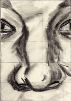
So, working with the information from Hammon and Britton, I used the grid system (1 inch blocks to place over the photo you're using and then 1 inch blocks on your sketch paper to transfer the image accurately), I did 2 more noses.


Don't you think the side view looks sad, or anguished?
No comments:
Post a Comment