Saturday, September 29, 2018

LEAVES WET-IN-WET (TRYING)


There is a definite learning curve to this wet-in-wet style with lots of patience playing into it.  You can't just go in and paint and watch the pigment diffuse and lighten over and over.  At some point, you have to wait until the paper is more matte dry (not dry but drier than when you first put down all that water and pigment) and then sharpen some areas.  And if you don't wait, you just get blurred, muddy stuff.  Like this one became.  A mess, really.  


So...I started over, following the directions in the Ewa Karpinska book more carefully and this is the start of the new one...

I'll darken and shape this one more.  I'm not crazy about that lime green background but blame myself for not thinking enough about that (I was concentrating on the leaves and rosehips).  Maybe I can go in and drop some more darker and varied color in the background later?

I guess what I'd like is somewhere between the top and bottom painting - not so soft but not so hard-edged, either.  Ugh!  OK, keep trying...


Thursday, September 27, 2018

FEATHERS


I tried to paint a few feathers without having any feathers in front of me, either real or in a photo.  It didn't work.  Turns out, I was painting them upside down!  Why didn't I know what a feather looked like until I drew it out and then saw what I was doing wrong?  Oh, well.  Those got tossed in the bin and this one survived.  


Then I remembered, I have bluejay feathers collected from the ground around the feeders.  (I have a family of about 7-8 bluejays that visit every day.)  Took those feathers to my art room and put them on my paper, traced around them a bit and then painted while looking at them.  Much better - but a bit stiffer because not done wet-in-wet.  I will do some wet-in-wet later after practicing more feathers - and doing some in other colors.


Tuesday, September 25, 2018

PLAYING WITH ALCOHOL INKS AND FLUID ACRYLICS ON YUPO


Just playing, pouring, tilting, moving and pigment around and letting it dry.  Walked away and returned to see something - a whiter shape to work up in the middle = another angel watching over us all (we can use it these days).


Sunday, September 23, 2018

WET-IN-WET STYLE A LA EWA KARPINSKA


Wet-in-wet painting from the Ewa Karpinska book.  You can try to paint it like the photo in the book, but it never turns out the same.  I remember doing paintings in watercolor class where we all painted from the same reference material the teacher provided - and each painting was different.  We all have our own take on things, our own style showing through, and our own choice of colors.  


I'm not unhappy with this; it just doesn't look like her painting.  Of course, she's a master at wet-in-wet painting.  

The last few wet-in-wet paintings have all been takes on her paintings in the book and none of them look like the painting in the book :)  


Happy October!


Friday, September 21, 2018

MORE WET-IN-WET STYLE PAINTING


Looks like a windy day after rain.


These last few paintings are all after looking through the wet-in-wet style watercolor books (2) I have to learn how to do this and not overwork.  The trick is saturation of the paper but also waiting until the paper is matte dry until adding the last, darker bits.  Since patience is a key ingredient, maybe that's why I haven't mastered this style in the years that I've been painting.  

Wednesday, September 19, 2018

WET-IN-WET WITH MY EWA KARPINSKA BOOK


Wet-in-wet using my least favorite colors (green), but not too bad.  Working with a book of techniques by Ewa Karpinska (she is fabulous at wet-in-wet style and very saturated paintings but still amazing).

Monday, September 17, 2018

WET-IN-WET IS MY FAVORITE STYLE OF WATERCOLOR PAINTING


Although the wet-in-wet style of watercolor painting is my favorite style, I often don't do this naturally.  So I have to remind myself - and do a bit of practicing - to get into the wet-in-wet groove.


So...taking out a book I've had for a while (by Ewa Karpinska) and a new one I purchased recently (by Jean-Louis Morelle) to play and test the waters (no pun intended!!).  There are some step-by-step works in both of these you can try and I recommend both if you really want to delve into this style of painting.  But be warned that the book by Morelle is 1/4 part about color theory.  You can skip it, if that's not of interest to you, and get right to the demos and talk about water, paint and paper.


Saturday, September 15, 2018

WET-IN-WET LANDSCAPE SCENE


Wet-in-wet technique, landscape with water and soft trees.

Copy of Ewa Karpinska painting in her book (she only has one in English) about the wet-in-wet style she uses.  Very saturated and soft.

Thursday, September 13, 2018

SIMPLE FLOWERS WET IN WET


Just playing with some wet-in-wet watercolor painting.


Not as wet on the greenery this time.


Tuesday, September 11, 2018

MAGNOLIA


I like it more since I pushed back the background a bit.  


Half sheet
Fabriano Artistico 140# cold press


Cotton Candy Magnolia

Sunday, September 9, 2018

COTTON CANDY MAGNOLIA


Named it the cotton candy magnolia because that's what it looks like to me right now.  I'll change that as I continue to work on it.  

Half sheet, Fabriano Artistico 140# cold press (has a bit of a tooth to it as you can see where the cerulean blue separated in the background).


Better, but still going to push that background back a bit using a glaze of cobalt blue.

Wednesday, September 5, 2018

EGRET IN THE MARSHES - FINISHED


Egret in the Marsh


Half sheet Fabriano Artistico 140# coldpress watercolor paper, Daniel Smith paints.

Monday, September 3, 2018

EGRET IN THE MARSHES


I started with a half sheet Arches 140# coldpress, drew the egret towards the middle and then put down some faint lines to represent the sections of the background stuff and water.

There is more to come as I try to keep the egret white until the end, when I'll warm her up a bit.

Friday, August 31, 2018

KINGFISHER 2


Finished the kingfisher.


Look out for that bill, fishes!!

Wednesday, August 29, 2018

KINGFISHER 1


Started this little guy on my sketchpad with Caran d'Arche watersoluble crayons, then sketched him on Arches 140# coldpress and began with the background color (something light so he could be the star).


Saturday, August 25, 2018

COOL DOWN


Something begun to cool us down.


It's been too hot and humid here in Kentucky already this summer.


I lost the photo of this one (when my laptop died) so will have to work up something to make shadows again (or search on the external hard drive for the photo).  

Until then, this one will sit in space.


Tuesday, August 21, 2018

SCARLET TANAGER FINISHED


Almost finished.  Need to do his eyes, bill, legs, and darken some areas.


Received my Fabriano Artistico 140# cold press paper from Dick Blick so have some full sheets now.


All done. 


What's next?  Something cool for the hot summer days here and around the U.S.  

Sunday, August 19, 2018

SCARLET TANAGER


A Scarlet Tanager sketched and colored (again, using just Caran d'Arche crayons) in my Strathmore sketcbook before drawing and painting on watercolor paper.

He's got a little winged critter in his mouth - could be a bee?


This is on a fourth sheet as I'm running out of full sheets of watercolor paper.

(I did place an order so should have some full sheets coming soon.)


Wednesday, August 15, 2018

PLAYING WITH COLOR


This began as just laying down colors (on a scrap piece of paper - not even sure what it is but not watercolor paper or maybe student grade paper) with Caran d'Ache watersoluble crayons.

Water added to bleed, blend and move the color around.  Done.


I am a Warrior...
or is that Worrier??


Warrior

Saturday, August 11, 2018

TOUCANETTE FINISHED


Ready for his eyes, feet and his perch and then done.


Pretty bird :)


The Toucanette from Costa Rica (smaller than a Toucan but a pretty good sized bill on him.)

Love the blue, violet and yellow bill and face area.

Thursday, August 9, 2018

TOUCANETTE


A little toucanette from Costa Rica, also begun with sketching and color in my Strathmore sketchbook before drawing and putting paint to Arches 140# cold press paper.


A little more color in the background of this one as a starting point.


Thought this was going to look stiff, too, so I went in with a scrubber brush and softened the edges before painting the bird.


I think this will look better once the bird gets his colors in.

Sunday, August 5, 2018

MOTMOTS SOFTENED


I did not like the hard edges on the Motmot painting, so I returned to it to soften the edges, using a scrubber brush.  I softened the edges, then dropped in more pigment.  Not great but I had nothing to lose with this one.

The next one is much better - you'll see.

Friday, August 3, 2018

MOTMOTS


Adding a little color to the Motmot painting...


And a little bit more...


Finished, but looking a bit stiff.  I think I'd do better by not doing the background as a whole and then painting the birds but bleeding and blending as I go along, leaving some white spaces in the background.  

I may try this one again.  But I'm running out of paper - need to place an art supply order!!


Wednesday, August 1, 2018

COLORFUL RETURN


After a short break and some quiet time - I also did some painting.  Back now and have some things to share.  Hope you like them.


Before painting, I did a sketch in my Strathmore sketchbook, then added color with Caran d'Ache watersoluble crayons to get me primed for the drawing and painting on watercolor paper (Arches 140# cold press).  

Here's the initial sketch and color of the Turquoise Crested Motmot (from Costa Rica).


And here's the painting, starting with the drawing on Arches 140# cold press paper (half sheet), the laying in the background using Daniel Smith Shadow Violet (one of my favorite background pigments).


Sunday, July 1, 2018

INK ON PAPER


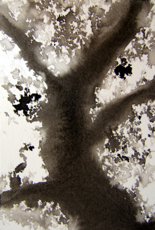
Three pieces of watercolor paper and ink.


These three seemed to make an interesting triptych when laid one on top of another, although they were painted separately without thinking about the previous one prior to doing the next.


Another ink on watercolor paper.


I'm taking some time off in July.  


Friday, June 29, 2018

ALCOHOL INK ON YUPO


Thought you might be wanting something with color after all the inky and conte crayon stuff in the sketchbook.

Just a scrap of yupo and alcohol ink.


Northwest Dunes


More yupo and alcohol ink.


Rise Up

Monday, June 25, 2018

FROM DRAWING TO CHARCOAL, INK AND CONTE CRAYON


In my Strathmore sketchbook.  


Not finished yet but getting there.  

Thursday, June 21, 2018

STRANGE ANGELS


India ink in my Strathmore sketchbook.  It bleeds through a bit - and then you can create something differnt from the bleed through on the other side - like this next one :)


A Picasso-ish creation?  This one on the back of the previous inked one but this one using charcoal.

(Have you been watching the NatGeo series Genius: Picasso?  What an ass the man was!! )


Charcoal in the sketchbook.


Again, the the sketchbook but using charcoal and conte crayons (chalk) along with blue pencil.  


If it wasn't so hot (heat index of 105!!), I'd go out to one of the cemeteries that have the angel statues and draw and/or photograph them as angels are on my mind.

Sunday, June 17, 2018

THIS AND THAT - INKY ANGELS


Inky angels...using the Strathmore Mixed Media paper (400 Series) and black ink.


Trying to just hint at the thing...


Ink on paper in my sketchbook and then wiped away the shape...


Sometimes one needs a few angels.  Not sure why mine are so dark - but they are.