Monday, February 29, 2016

CLASS STUFF: PEPPERS


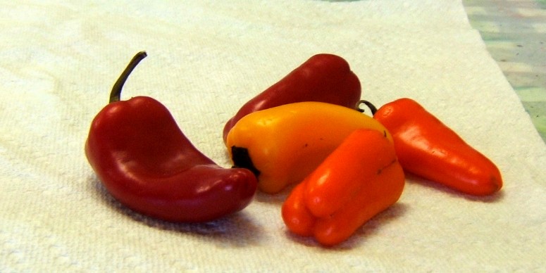
Tuesday, I laid out some small peppers in case my students didn't have work they wanted to do.  One student continued on her painting of the old rusty truck, using the "darks first" guidelines and lessons from the previous work.  One student did this as she liked the colorful peppers.  


First, we laid out 5 peppers, arranged them and drew them.  Then I enlarged them a bit on the copier and that was traced onto an 8 x 10" piece of Arches watercolor board (cold press).


And we painted.  She did more glazing.  I put my colors in and drizzled and splattered = fun :)


Added some waterproof ink (Pitt pens in black) to give it a more illustrative look and pop more, and splattered more (I do love to splatter!).


My student will finish her version this Tuesday and the other student will continue with her truck once she decides on the color she wants.  Her dark and varied background is done - and done well (although she is not happy with it).


HAPPY LEAP DAY!


Saturday, February 27, 2016

AMI GINGER MORNING


I started this with Shadow Violet in the background.  I really love how that color separates and creates interesting things.  I will need to darken it a big in the bottom but will leave the top the way it is.


Then beginning with the leaves - violet/maroon/wine colors.


Before starting on the ginger leaves and corm (?).


This is on a half sheet (15 x 22 inches) Arches 300# cold press paper.  I like the 300# paper and seem to have acquired a few sheets so I'll be using them to try out how they differ from 140#.  I already see there is much less buckling when painting wet-in-wet.


Thursday, February 25, 2016

PLANNING FOR ANOTHER


I began with the Tombow ink pens and water but overdid it so added some color - not great but you get the idea for this little study.


Next, drew out the photo onto tracing paper and will trace that onto watercolor paper (Arches 300# cold press half sheet).  


Traced this onto Arches 300# cold press paper.


Then the painting begins...


Tuesday, February 23, 2016

THE FINISH


AMI Morning Light


Full sheet (22 x 30 inches) 
Arches 140# cold press paper

Friday, February 19, 2016

ALMOST THERE


After working on the ink drawing and painting, I think I am now ready to go back to the watercolor painting and bring it to completion.  Getting close - almost there...

Still need to paint "the star" of the painting - that one draping leaf.

Wednesday, February 17, 2016

WIP STILL


Still doing much more thinking and planning of this painting than actually painting.  Yesterday in class I had my students do a value study with the focus on the darkest darks.  After the photo was traced, they used a Tombow pen (archival watersoluble ink) to draw in the darkest darks.  Then touching the drawn ink with a wet brush, they pulled out the blacks and greys and left the whites pure.  So that's what I did with my morning leaves painting - a good value study.  Here is the photo in black and white and the photo traced onto watercolor paper and drawn into with the black Tombow pen. 


 Next, water is touched into the blacks and edges to draw out the darkest darks and the medium values...

At this point, too many pure white areas so you bleed out a bit more of the darks (the bleeding ink sometimes goes blue-grey and sometimes it turns a bit green-grey in color).

This is on a fourth sheet of Arches 140# watercolor paper - cold press.  


Now, this is what I want the watercolor painting to look like, only in color.


I think this value study will help me get there when I put down more color...and I see where I've messed up in the full sheet drawing so...start again?  Or just roll with it?

Monday, February 15, 2016

THE DO-OVER CONTINUES


Working slowly.  I have lost my momentum on this one.  In fact, I've lost my momentum for anything but sitting on the sofa and reading while eating chocolates.  We have 3 inches of snow today and ice predicted tonight/tomorrow morning.  Time to hibernate until spring...whenever that comes.


Using Moonglow mixed with Perylene Green for the darkest darks.  Moonglow mixed with Quinacridone Burnt Scarlet for the deep plum colors of the shadowed leaves.  


And trying out colors to get the bold yellow-orange-reds of the brightest leaves to come...

Hansa Yellow Medium (like New Gamboge), Pyrrol Orange, Raw Sienna, Quin Burnt Scarlet - think those colors will get me where I need to be with the bright leaves.


Saturday, February 13, 2016

SOMETIMES YOU NEED A DO-OVER


This painting was moving along, but there was something niggling me and annoying me about it and I just kept trying to get it where I wanted it - in essence, forcing it.  And everyone knows you cannot force watercolor!  


So...although it looks okay here on the screen, it does not look good in "real life" so...time for a do-over.


And the first thing I did was draw it out on a piece of tracing paper - large tracing paper (Canson 19 x 24 inches tracing paper).  


Then I traced that onto a full sheet (22 x 30 inches with a little extra off the side and bottom) of Arches 140# cold press. 


I began with the background in Perylene Green with a touch of Quinacridone Burnt Scarlet in areas (and Hansa Yellow Light closest to the leaves to get a nice glow around them).


Now...plums and clementine colors in the foliage without being heavy-handed (fingers crossed), and I might just have a nice painting.  But if I don't, I'm not adverse to trying it again...since I'm trying to enjoy the process and not rush to the outcome as much this year.


And have a lovely, loving Valentine's Day, whether you have another with you or you are solo - do something loving and kind and good for yourself or your significant other - let's make every day Valentine's Day (without the chocolates - we all don't want to be gaining 5-10 pounds this year! ha ha).


Thursday, February 11, 2016

GOLDEN LIGHT - WIP CONTINUES


Well, this is definitely a work in progress.  I darkened the Shadow Violet background by layering Moonglow over it.  But...maybe that was not a great idea.  I may need to touch in some dark greens in that purple background to make it look more like foliage...not sure.

For now, the following steps include adding some quin burnt scarlet and orange to the golden orange leaves, getting in some greens, and making sure I have the right values against the white areas to make it pop. 

Tuesday, February 9, 2016

GOLDEN LIGHT - WIP


From a photo taken during our recent stay on Anna Maria Island.  The house we rented had a beautifully landscaped back yard with lots of interesting plants around the pool.  I took a lot of photos when the sun came down through the leaves and this is the first painting I'll do from those photos in early morning light.

Began with the drawing on watercolor paper and then put in the background using Daniel Smith Shadow Violet.  It may need to be darker.  I will work on that before I finish but want to start on some of the leaves.


Since I'm working very wet-in-wet (prewetting the areas I'll paint into, section by section), I'm working on a towel over my table and weighting down the paper so it straightens out as it dries.  (Learned that trick from Carol Carter.)  Some of the leaves are deep purple-grey and some are golden orange red colors so I'm looking forward to putting the color into those leaves.  Then I may not need to darken the background at all.


Stay tuned for the next steps...

Sunday, February 7, 2016

SUPERBOWL SUNDAY

This post has nothing to do with Superbowl Sunday, except the it is posted on that day!


This is the ONLY watercolor sketch I did in my Stillman & Birn watercolor sketchbook while on vacation.  It was not a very creative 2 weeks.

We did see the full moon out the windows during our stay.  Unfortunately, we never saw it over the water due to storms and clouds.  

And it always takes me a few days - or weeks - to get back into the groove when I return home.

So I am finally working on something from the many photos I took during our stay away, and I'll share it as a WIP (Work-In-Progress) as I go along...


I have scheduled a Pilates session tomorrow - and they are predicting snow showers with accumulations and COLD temperatures, so I may just have to stay in and paint instead.  Hope you don't have strong storms or snow accumulations this week - let's hold Puxatawny Phil at his word (he did NOT see his shadow on Groundhog Day so...an early spring is on its way).


Friday, February 5, 2016

AMI RENTAL - PRETTY THINGS IN CASA VIOLETTA


Some of the pretty things inside the house we rented on Anna Maria Island...


I wanted this little table at the bottom of the stairs.  So many neat drawers to hold treasures!


The house had way too many bedrooms for just Sweetie and me, but it was the cutest place we could find at the time we booked.  Each room had nice artwork (all prints but nice prints on canvas) on the walls.  I like that touch - makes you feel like you are in a home, not just a rental house.


The many paintings of boats (especially this one) made me think of Jeanette Jobson's boat paintings in oil, using a palette knife.  This print looked like the original was with a palette knife.


Even the poolside chairs were pretty colors (and compliments on the color wheel)!


The only pink sunrise I saw while we were there.  This was the view out the back, over the pool, looking toward sunrise.  Pretty pink sky the last morning we were there. 

Goodbye, Anna Maria Island!  See you again som


Wednesday, February 3, 2016

SCENES FROM ANNA MARIA ISLAND


Just a few more photos I've resized and wanted to share before I get to work again.  Of course, I still have all those Christmas present books to read, too...so I may be lazy for a while before going back to the paints...

"She's back."  
"Yes, I see that."  
"Ignore her and maybe she'll go away."  
"What is her fascination with us, anyway?"
"She wants to draw us?  What does that mean?"
"Shhh.  Don't look at her.  I'm sure she'll get bored soon and walk away."


The storms brought up some interesting things on the beach, like this horseshoe crab.  I had never seen one on the beach before.  


I had never seen surfers on Bean Point, either, but there were about two dozen of them, all young, lean and fierce in that icy cold water.


The house we rented (named Casa Violetta) was beautifully landscaped with lots of interesting plants blooming and growing around the little pool (which was WAY too cold to do more than dip a toe in to test the water = brrrrr!!"


Don't know what this plant is or what the berries are.  The green things behind is how it begins, then grows out into the red berries and then those shrivel and die off.  But haven't a clue what it is. 
I liked those red berries enough to pull a bit off for a possible photo set-up and painting later, though.


Possible painting?


Back to the beach one day when it warmed up and the wind died down.  A man was busily carving this dolphin out of the sandy beach = pretty.

Sunday, January 31, 2016

RETURNING


Returned home yesterday evening after 2 weeks away on Anna Maria Island - again.  Spent the whole 2 weeks in a large, pretty, violet house that had so many smart appliances that both Sweetie and I felt dumb (especially when the alarm on the refrigerator started going off and we couldn't find the manual to figure out why!! = turns out I had the door open too long!!!  What???).  The place was large, pretty, clean and had a little pool in the back (which was unuseable due to the temperatures - which sometimes went down to 45F at night = brrrrr).  


We had tornadoes touch down close by the first week, then cold, windy days; then warming enough to bring more rain rain rain.  I think we may have had 5 days of sunshine total, but still checked out the beach each day and, especially, at sunset.  So...until I catch up with things, here are some sunsets on Bean Point (the north end) of Anna Maria Island.  Enjoy!


Friday, January 29, 2016

POEM FOR JANUARY

Thin Ice
   by Ellen Doré Watson


Reedy striations don’t occlude the beneath—
earthy mash of leaves, flat pepper flakes, layered,

tips protruding, tender-desolate above a mirror
surface, gently pressing on horse-mane, nest material,

tickle-brush, fringe. Buff block-shapes further down,
ghost-bits of green-green, a lone leaf burned white.

My thrown stone skitters on ice. The next, larger,
plunks through and for a moment I am a violator

but then I see it opened a bubble cell, a city,
a lesion, a map—the way in cold and luminous.


Ellen Doré Watson 
is the author of Dogged Hearts (Tupelo Press, 2010). 
She’s the director of The Poetry Center at Smith College 
and lives in Conway, Massachusetts.

Wednesday, January 27, 2016

FAUX ENCAUSTIC - SECOND TRY


Using the technique from the faux encaustic demo in the Winter issue of Acrylic Artist, I started another.  This one is on canvas board (8 x 10 inches) I had in the corner (I seem to have a lot of bits and pieces of boards and things I've collected over the years.)


I began by choosing 3 blues and putting them down in a sweeping motion.  


After it dried, I put down the second layer, separating "top" and "bottom" of the painting and laying plastic wrap over the top while the paint was still wet.  Letting that dry overnight, I pulled off the plastic wrap and here is what it was at that stage.  (It had to be tilted for the photo so the shine didn't block the painting in spots.)


I like it.  It makes me think of a strange seascape with a wild sky!  So I will let it sit for a while and decide what I should do next.  

The problem with painting with acrylics, for me, is that I'm unsure where to go when I get to a stage that I like - but that needs a bit more.  I guess that comes from more playing and experimenting and trying new things.  Nothing can become too precious to change.  


Monday, January 25, 2016

ELVIS IS ON THE BEACH!


Another drawing in the Strathmore toned paper sketchbook (tan).  I like the warmth of this but like the gray toned paper, too - don't think they make other sketchbooks that aren't white.

These are Royal Terns but Sweetie and I call them Elvis birds because they look like Elvis with his black hair and their look of cockiness.  They aren't afraid of looking right at you as if they are saying, "Who said you could take my photo, tourist?"

Elvis Bird on the Beach


Saturday, January 23, 2016

WINTER LEAFAGE

Winter Leafage
 by Edith Matilda Thomas


Each year I mark one lone outstanding tree,
Clad in its robings of the summer past,
Dry, wan, and shivering in the wintry blast.
It will not pay the season’s rightful fee,—
It will not set its frost-burnt leafage free;
But like some palsied miser all aghast,
Who hoards his sordid treasure to the last,
It sighs, it moans, it sings in eldritch glee.
A foolish tree, to dote on summers gone;
A faithless tree, that never feels how spring
Creeps up the world to make a leafy dawn,
And recompense for all despoilment bring!
Oh, let me not, heyday and youth withdrawn,
With failing hands to their vain semblance cling!


This poem is appropriate to the time of year - and also because I will be having another (!) birthday this month.  The days, weeks, months and years continue to add up until I am an age now that I feel, not quite comfortable with, and one that is coming very close to a milestone year that may mean I've passed my sell-by date!


Thursday, January 21, 2016

TAN PAPER DRAWING - BIRD IN TREE


On the Strathmore Tan Toned paper sketchbook.  I enjoy doing these black and whites - it really makes you see and hones your drawing (and seeing) skills.  But to get my color fix, I play with the acrylics on canvas/board/etc. and do this while the paint dries (or I don't know where to go next).


Bird in Tree

Tuesday, January 19, 2016

ANOTHER ACRYLIC PAINTING BEGUN - STONES?


Using a very long piece of black gessoed canvas board (not sure how I ended up with that, but it was in the pile of boards I keep in the corner).  

First, I put down the gesso juice mixture (white gesso, acrylic medium, water) over the black and pressed a stencil over it, creating the stones.  Then I used a small plastic "brush" tool and wiped across the top.  So it's looking like sea and stones to me right now.  

I am letting it sit and dry.  

I like this start - now what?  Perhaps a little glazing of color?