Just a little card I made of October leaves. So pretty this time of year, but almost have hit their peak and are browning or falling now.
Just a little card I made of October leaves. So pretty this time of year, but almost have hit their peak and are browning or falling now.

Worked a bit more on the middle yellow onion to give it more dimension. Better now.

Sometimes you just need to play and enjoy the paint doing it’s thing. October brings out the yellows, golds, oranges and reds and that’s what I played with here on a half sheet from my Strathmore Visual Journal (140# watercolor cold press).
This little painting was made after watching the latest Strathmore online lessons (free) about watercolor and lettering. My lettering is not beautiful or elegant, but it’s the way I do it. The saying comes from Angela Fehr, who gives online lessons, too and I’m signed up for her Watercolor Mastery course right now - a 3 month course to try to break through into the next level!! And lots of play and experimentation. So, I may be absent for a while unless I have little things to share.
Take care, enjoy your fall (or spring) weather and stay safe, wherever you are. Keep painting, writing, creating, living!!

Just a little something to keep me painting something while I’m waiting for something...
Gouache on watercolor paper.
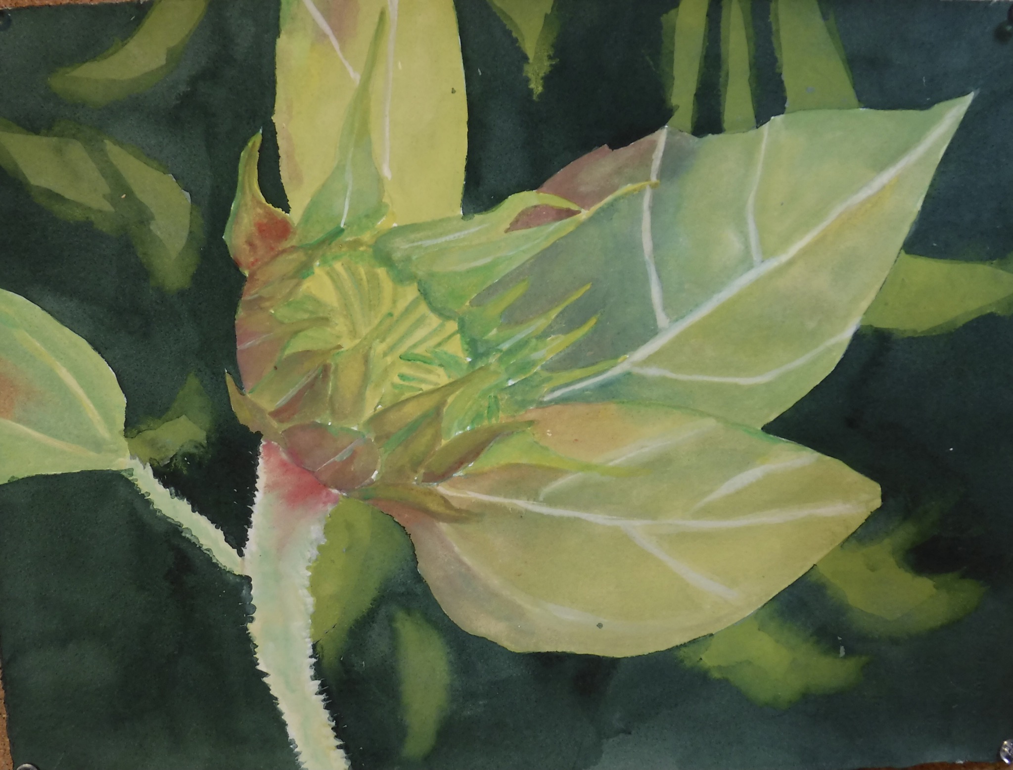
Tried to make the photo match the real life painting more (the previous photo was too warm all over). Added some darks here and there to make it better.

A small painting using gouache (except for watercolor background) on Arches 140# cold press paper. Just using a different medium to play for a while. Other than a bit more darks in the leaves close to the pod, it’s done.

After the experimentation with the background, I chose this purple color and went with it. Changed the top to a branch, too, to make it more natural. Not done yet - I made sure I had a light hand with the green of the chrysalis itself and will go back in and glaze darker areas over and then put in the yellow/gold.
I like it better so far but think I could have gone even darker in the background. This may be just one of those paintings you never like, no matter what?

I started this painting of a monarch butterfly’s chrysalis. Ruined it. Threw it away. Started another. This is what I ended up with. Hated it. Thought about why it wasn’t working for me = background color choice? Maybe. So...thought about purples and reds behind the chrysalis instead (darker, too).
I experimented with a few colors I have. Knew right away the dark purple on the left top was what I wanted. Sometimes you just have to start over.

Will the third time be the charm?
We shall see!

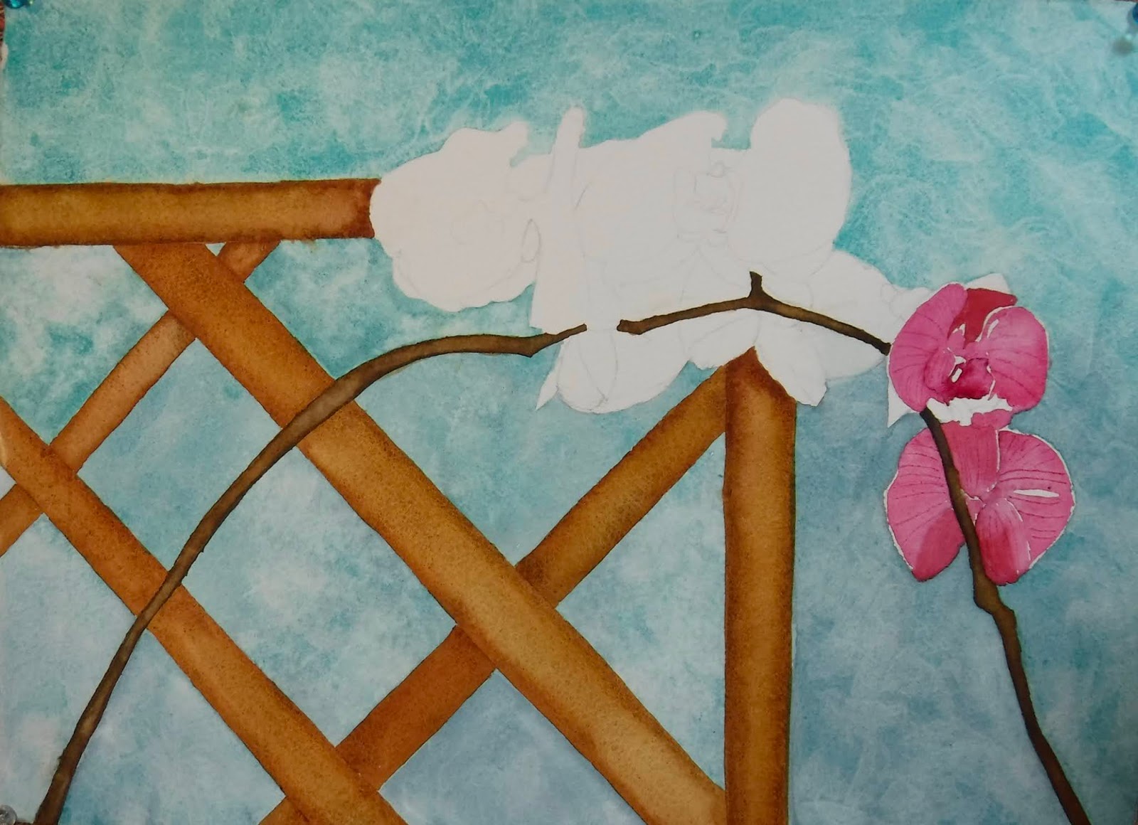
Darkened the wooden slats and the background, then added some dark interest in the petals.
Done.