Monday, October 19, 2020

OCTOBER LEAVES


Just a little card I made of October leaves.  So pretty this time of year, but almost have hit their peak and are browning or falling now.  

Tuesday, October 13, 2020

GOUACHE - A BIT BETTER


Worked a bit more on the middle yellow onion to give it more dimension.  Better now.

Sunday, October 11, 2020

PAINT PAINT PAINT UNTIL....


Sometimes you just need to play and enjoy the paint doing it’s thing.  October brings out the yellows, golds, oranges and reds and that’s what I played with here on a half sheet from my Strathmore Visual Journal (140# watercolor cold press).  


This little painting was made after watching the latest Strathmore online lessons (free) about watercolor and lettering.  My lettering is not beautiful or elegant, but it’s the way I do it.  The saying comes from Angela Fehr, who gives online lessons, too and I’m signed up for her Watercolor Mastery course right now - a 3 month course to try to break through into the next level!!  And lots of play and experimentation. So, I may be absent for a while unless I have little things to share.


Take care, enjoy your fall (or spring) weather and stay safe, wherever you are.  Keep painting, writing, creating, living!!

Wednesday, October 7, 2020

GOUACHE ON WATERCOLOR PAPER


Just a little something to keep me painting something while I’m waiting for something...

Gouache on watercolor paper.
Tuesday, September 29, 2020

BETTER


 Tried to make the photo match the real life painting more (the previous photo was too warm all over).  Added some darks here and there to make it better.  


Sunday, September 27, 2020

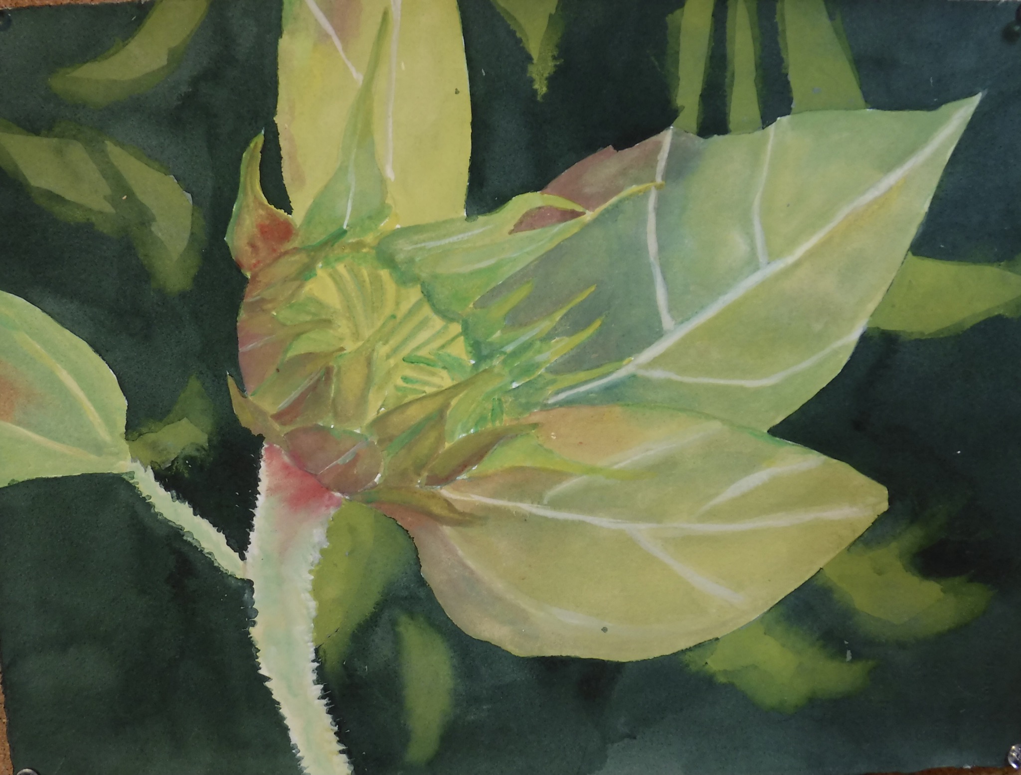
GOUACHE ON PAPER


A small painting using gouache (except for watercolor background) on Arches 140# cold press paper.  Just using a different medium to play for a while.  Other than a bit more darks in the leaves close to the pod, it’s done.  

Sunday, September 13, 2020

BETTER?


After the experimentation with the background, I chose this purple color and went with it.  Changed the top to a branch, too, to make it more natural.  Not done yet - I made sure I had a light hand with the green of the chrysalis itself and will go back in and glaze darker areas over and then put in the yellow/gold.

I like it better so far but think I could have gone even darker in the background.  This may be just one of those paintings you never like, no matter what?

Friday, September 11, 2020

WHEN IT TURNS OUT UGLY....?


I started this painting of a monarch butterfly’s chrysalis.  Ruined it.  Threw it away.  Started another.  This is what I ended up with.  Hated it.  Thought about why it wasn’t working for me = background color choice?  Maybe.  So...thought about purples and reds behind the chrysalis instead (darker, too).  


I experimented with a few colors I have.  Knew right away the dark purple on the left top was what I wanted.  Sometimes you just have to start over.


You can see that ANY of the darker background  colors makes this little green thing stand out more so...


Will the third time be the charm?


We shall see!  


Monday, September 7, 2020

FINISHED


Darkened the wooden slats and the background, then added some dark interest in the petals.  


Done.
Saturday, September 5, 2020

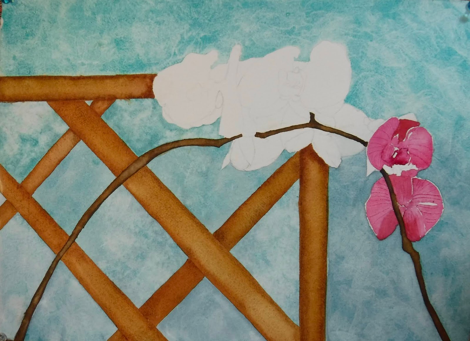
ANOTHER STEP OR TWO


Slowly, slowly.

Need to straighten the top wooden slat as that bothers me.  

Thursday, September 3, 2020

ORCHIDS - STEP 2 OR 3


Next steps in the painting of the orchids.  Nothing special, just trying to shape the blossoms after doing the wooden “scaffolding” and the dark stems.  

I am positive, now, that the pinks and the background colors are too sweet so will darken the background - maybe just glaze over it with cobalt blue or a mix of darker blues.  

Monday, August 31, 2020

SOMETHING WORKING ON NOW


Just a little painting from a photo reference taken year’s ago when we visited our friend in Vancouver Island, BC, Canada.  Orchids growing and lots of photos taken.  

I need to take care to not make it too sweet with the pinks and blues.  

Tuesday, August 25, 2020

MOLESKINE SKETCHBOOK STUFF


Just some nature sketches done in my moleskine book (I have so many sketchbooks and this one was started and left behind as I purchased others).  I did not do this on site but brought the goodies inside and worked on the sketches in my little art room.  I admit it, I am never going to be a plein air sketcher or painter!


The moleskine paper is a bit warm and I prefer bright white paper, but this is find for doodles and sketches just to fill the pages.  


Pulled some of the leaves off the little branch that held the acorns.  We have a huge oak beside our house which we like but it does often sound like the squirrels are bowling on the roof when the nuts start falling and rolling :)


Thursday, August 13, 2020

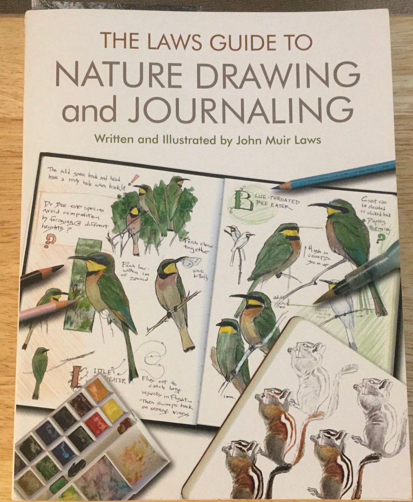
JOHN MUIR LAWS BOOKS


I can add to my instruction by going through 2 books of John’s that I’ve purchased.  I need to go slowly and try out the demos, etc.  


The pale blue pencils are great to use to start a sketch - then you can work towards the final with graphite.


I may just go out in the field - maybe - and try my new pencils and new Stillman & Birn sketchbook out.  Then again...I’m not much for sitting outside in the heat, humidity, and bugs.  We’ll see.  May just observe, take notes, and take photos to draw and paint inside later.  (We can’t all be plein air painters!


Tuesday, August 11, 2020

MORE BIRD SKETCHING


More birds from the John Muir Laws course.


The bird showing the inside bone structure is a cut-out offered to us.  The head and body are separate so you can move the head into various positions, getting the right shape when the head is at various angles.  Pretty cool.  


Sunday, August 9, 2020

BIRD SKETCHING - JOHN MUIR LAWS INSTRUCTION


Back in May, I participated in an online course (free) through California Audubon, taught by John Muir Laws.  It was an interested 3 session (spread over 3 weeks) course teaching about sketching birds.  Learned quite a bit I hope I can remember when I get out in the field (or sunroom, in my case) to watch and document the birds coming to the feeders.  


So here are a few I did while watching the lessons (I missed the first one so had to catch up later on John’s blog/site).  

I did the sketching in blue col-erase pencil so it was light enough to go over again with darker graphite later.  John uses a pale blue pencil that draftspersons use which is really more invisible after going over with graphite or other colors.  


You may be able to read the comments and instructions in the blue.  I ordered the pale blue pencil John uses because, well, why not, it might inspire me to draw more if I know that first sketch can be as rough as anything and then I can adjust it with graphite as I go over it.  Being able to cover up mistakes or errors in shapes and sizes is a good thing, right?


I have returned to the old Blogger interface but know it will be taken away after the end of August so we’ll see what I do after that.  

Thursday, August 6, 2020

HATE THE NEW BLOGGER INTERFACE

HATE THE NEW BLOGGER INTERFACE.  

TOO MANY GLITCHES TO WORK - OR CARE TO TAKE THE TIME TO POST.

MAY BE ENDING MY BLOG BECAUSE OF THIS.

Monday, August 3, 2020

GRAPE


Didn’t care for the way the previous popsicle painting was coming along so did another single ice pop - this one in grape.  Done entirely with only Mineral Violet, a delicious purple color that lifts well whether wet or dry.  

Friday, July 31, 2020

POPCICLES


Popcicles and watermelon - more to come as I slowly work a little on this one.


Wednesday, July 29, 2020

ICE ICE BABY


Trying to cool the heat!  May do a few of these.  


This one is watermelon - yum!