Thursday, February 28, 2013

WHITE STAG FROM CLASS


In my beginner class, we are still working on darks and lights.  Here is a white stag (photo Sweetie took around Yellowstone Park) in front of a dark wall.  I painted this little painting (1/8 sheet = 7.5" x 11") and the students painted the little dark calf in front of a light wall (or in a light field). 

For the wall, I used just 2 colors: 
Cobalt Violet Deep + Quinacridone Burnt Orange

I used the same colors on the stag with a bit of Raw Sienna in the warm spots and on the antlers.  And the grass was the wall color with Sap Green over it.


Wednesday, February 27, 2013

ONE WORD WEDNESDAY


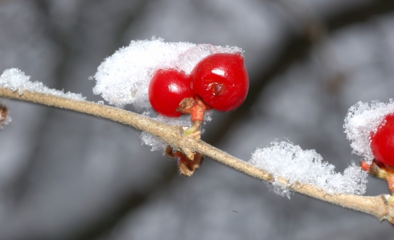
Frosty

Photo by Jerry H. Carpenter

Tuesday, February 26, 2013

OBJECTIFICATION

I did not watch the Academy Awards Sunday night.  Turned off the t.v. and read instead.  Of course, one cannot help seeing all the replays and comments after the fact.  Made me think of how beautiful and perfect everyone has to pretend to be to make it in the movies - unless you are supremely talented like Daniel Day Lewis and Meryl Streep.

And read this poem that came into my inbox - so appropriate!


The Objectified Mermaid
by Matthea Harvey
 
The photographer has been treating her like a spork all morning. "Wistful mouth, excited tail! Work it, work it!" He has no idea that even fake smiling spreads to her eyes and her tail and there's nothing she can do about it short of severing her spine. Without asking, the assistant re-sprays her with glycerine. It's gonna be hell getting all that grease off her scales tonight but she can't scum up her tank at the bar--its weekly cleanings seem more like monthly these days, and fewer and fewer patrons have been inviting (read: paying) her for a Tankside Mertini and quick feel of her tail. There's one regular who lapses in and out of consciousness and he's the real reason she stays. Every once in a while he seems to have forgotten where he is and he looks at her with the kind of wonder she imagines her grandmother inspired when she first risked coming ashore. After an hour under the studio spotlights, she's starting to smell pretty fishy. Can't blame it (as she has before) on her standard seaweed bra because this fool of a photographer has her holding two clear fishbowls in front of her breasts so it looks like goldfish are swimming past her nipples. She's supposed to pretend it tickles. She wants to ask if he's heard the phrase "gilding the lily" which she recently learned at Land Berlitz. When asked if she's tired, she lies. A downward spiral means the opposite up here.


Monday, February 25, 2013

RESEARCHING TOMATOES


There are so many heirloom tomatoes and so many interesting names for them.   Lovely, dark colors, reds and greens, yellow and almost blacks.  Interesting just to look at them all.  I wanted to view some of the varities since I'm still painting on my Utah Heirlooms - those we saw and purchased the last time we were in Salt Lake City.  They had a huge outdoor market and the tomatoes tasted as good as they looked.  I have an artist friend whose husband grows them, too.  And they are so good - like the tomatoes my grandmother fed me as a child.

I'm changing up the colors - not all dark red with green striped, as the photo shows.  Sweetie has trained me not to be so picky and taste the yellow tomatoes, too.  So far, I haven't tried a green one - or a black one.

Went out today to meet the coordinator of the Art After Hours Sweetie and I have been invited to - we will show our work at the Ft. Thomas branch of the library in July.  We picked out our spots and need to decide how many paintings/photos to show.  

I also mailed out my cd for the WACC 2013 juried show - I have 2 entries and hope one gets in.  If not, I'm not out more than the cost of the cd and check for entry (I am not going to mat and frame either one until I know one got in.)


Sunday, February 24, 2013

SUPPORT FOR ARTISTS

Jeanette Jobson, working artist from Newfoundland, is raising money via Indigogo for a small printing press and equipment for her latest venture.  Please visit her Indigogo site to see what it's all about. 

You know, these small home presses are still quite expensive and if you know Jeanette then you know she is always working towards achieving her artistic goals.  She is truly an inspiration!  And inspiring artists should be supported.  So go on over to her site:

http://www.indiegogo.com/projects/339532/

and decide whether you have a few $ to spare to help her meet her goal. 

Donate to her cause and see what she does in 2013!  


Thursday, February 21, 2013

TRASH CAN TOMATOES


Well, this one is torn and in the trash now.  It began as a nice painting and I worked on it a while and then it stumped me - I knew it was just about to go wrong so put it aside and it sat for months.  I picked it out of the pile the other day and began working it again - and, yep, it went wrong.  Quickly.  But I didn't give up.  I kept working it, even taking it and washing it all off in the bathtub and working more!  Sometimes you just have to know when to say Enough is Enough!  Part of the problem = it was a full size sheet (22" x 30") and I had to wrangle it around in my little art room, trying to paint without a table big enough to paint on.  Of course, that doesn't excuse the overworking and the black bg - I was willing to try anything at that point to save it but it was already DOA!  (Trust me, the photo makes it look so much better than it looked in real life.)

So - say goodbye, tear it up, throw it away.  And begin again.


This time, on a half sheet (15" x 22") which is more maneuverable for me.  However, these are not the pretty red tomatoes you see in the store.  These are heirloom tomatoes - the duller colored, often bi-colored tomatoes that cost more but taste oh-so-good. 


And I have to do some things right in this one =


1) don't make them all the same color and value,

2) don't put a solid bg behind them,

3) break up the color in places and leave some whites for goodness sake,

4)  spend more time looking at the photo reference and less time painting on color.


If I can do these things, I think it will work.
If not, well this one will be easier to tear up since it's smaller!

Wednesday, February 20, 2013

ONE WORD WEDNESDAY


Follow

Photo by Jerry H. Carpenter

Tuesday, February 19, 2013

THE RULES OF THE GAME

I am looking through paintings from last year to find 1 or 2 paintings to enter in the upcoming Woman's Art Club of Cincinnati juried show. (deadline March 1).


I thought you might be interested in reading the entry terms, as they have them in their brochure:

"Work must have been conceived and executed by the extrant after January 1, 2012, completely original, the work of the entering artist, and never have been entered in a previous juried exhibition."

I like that they are keeping things fresh - no old paintings from year's ago!  Too often artists have a lot of good paintings and they just recycle them into all the shows they can get into, if the calendar will allow.

I like that they are aware that work should be original.  (Although they didn't say it, I would hope that means nothing created in a workshop or in class with a lot of teacher input and help.)

I'm unsure about it being the work of the entering artist - do people actually put in things they have not done? 

And does "never have been entered in a previous juried exhibition" mean it didn't get in last year's show, or that it wasn't even put in for last year's show? 


It's a good thing to carefully read the rules of any show you enter.  You don't want to be disqualified for a mistake or a misunderstanding.  And you want to show your best work so look at your work with a critical eye - and if you can't do that, then ask for help.  But you be the deciding judge.  Don't exclude a painting you love because someone else loves another one instead.


I am also trying to go back to finish some unfinished work, but, honestly, I think I've forgotten how to paint!  Do you ever feel that way?  That the basics are gone for some reason?  You overwork, you can't get good shapes, you lose your whites, all the problems arise and it looks awful to you?  What's up with that?  I sure hope I get my mojo back soon - it seems the watercolor fairy has flown the coop and even leaving out chocolates won't bring her back...

Monday, February 18, 2013

LITTLE BLACK CALF REDO


It's better than the first version. 

I used Indanthrone Blue + Quinacridone Burnt Scarlet for the mix on his body - with a touch of Chinese White on his back and knees to lighten them a bit. 

I've gone through the JSSargent book and drooled over the paintings there - that man loved to travel and returned to the same places over and over to document and paint what he saw.

Now on to the second book I got for Valentine's Day - which should take me a month to go through!  But already learning more about watercolor - and American watercolor, in particular. 

Friday, February 15, 2013

VALENTINE SURPRISES


I hope you got some sweet things for Valentine's Day.  Here is just part of my haul! ha ha  (And yes, those are socks with hearts and frogs on them.  I don't know where Sweetie finds these things, but I thought they were extra cute.)

The two books are going to be marvelous to read and view - plenty of inspiring watercolors to get me out of my rut, I hope. (One on John Singer Sargent and one on several watercolor artists from Georgia O'Keeffe to Winslow Homer and Sargent and on and on...)

I ate 3 chocolates yesterday and got a migraine an hour later :(  Perhaps I should just go cold turkey with chocolate and call our lifelong romance to an end?

I also got flowers and a Starbucks card!  Wheeee!!!


But I didn't just sit around eating chocolates and looking at watercolors and wearing my froggie heart socks.  I even went down to my art room (after the migraine eased up with medication) and began the little black calf painting again.  This time, the wall will be white.

I masked the calf off and the upper part and bottom part and splattered and sprayed water to get the look of the wall so it remains white with some splotches.  Then removed the masking and did the bg and the foreground.  I think I'm going to make the foreground darker and more muddy looking than green.  Then I'll paint the little calf in black without using black.  Last time I used Prussian Blue + Pyrrol Scarlet.  I'll use a different mix this time.


Thursday, February 14, 2013

VALENTINE POEM


Sometimes with One I Love
by Walt Whitman
 
Sometimes with one I love I fill myself with rage for 
   fear I effuse unreturn'd love,
But now I think there is no unreturn'd love, the pay 
   is certain one way or another,
(I loved a certain person ardently and my love was 
   not return'd,
Yet out of that I have written these songs.)


How true!  Even love in vain can be the basis for art :)
I hope your Valentine's Day is special, whether that box of chocolates and flowers are bought for you by someone else or by yourself (we must never forget that we have to love ourselves as much as we love others).

May you see red today
in a very colorful way...
A touch of satin, silk, or lace
to put a smile upon your face.

Wednesday, February 13, 2013

ONE WORD WEDNESDAY


Puppy-Love

Photo by me (of Deb Ward's dog, Stray).  He used to love me but I haven't been over in so long, he's given his heart to another lady who gives him food and treats!

Tuesday, February 12, 2013

LOOKING FOR A SPECIAL GIFT?

Look no more!  Dallas chocolatier, Andrea Pedraza, has created something all women will love:  Chocolate shoes! ha ha 


Now, do you eat them, or do you wear them?  Because you wouldn't want to eat them after you wear them, I say eat them! ha ha

The article I read about them say they run from $30 to $55 and that men buy the majority of the heels.  Clever chocolatier, clever men! 

See the YouTube video and how Andrea makes these here:
http://www.youtube.com/watch?v=PKoi2aSkcEE

Like all good things, her "signature" chocolate designer pumps are being copied by others.  I found several sites around the U.S. where they are claiming they are their own personal design - but they looked more like Barbie shoes than these beauties.


Happy Fat Tuesday!!!

Friday, February 8, 2013

HOW NOW


The little black calf continues.  Working on getting good, varied darks.


Since I'm not that happy with the wall behind him, I think I'll crop it closer.  (Why am I not happy with the wall?  Because it's too heavy with pigment.  Should have left it pure white with splatters and cracks only to define it.  A lesson learned...)

Now to do something light against dark for class...

I need to search through my paintings done last year and choose 2 entries for the 120th Annual Juried Exhibition for the Woman's Art Club of Cincinnati (WACC).  Early bird deadline is Feb. 15th and they are taking cds now instead of the artist taking their entries in, leaving them, going to pick them up (one or both) when the judging is over.  Much better, except for those who know nothing about creating jpegs and putting them on cds.  Everyone is being forced into the 21st Century, whether they like it or not.  If I have anything good enough, it will be small.  I haven't tried anything large for a while.  It's always interesting to look back at work you did a year ago and critique it with a less impassioned eye.  You know, you always are so attached and committed to a work when you've just finished it that it does you no good to critique it then - you should wait a month or two or three before looking at it again and really seeing if it's good or bad or if there is something it lacks.  I've found that what my previous year's work lacks is...wait for it!!...good dark values!! ha ha  Which is something that can easily be remedied, after the fact.

Take a look at your work from last year.  What works?  What doesn't?  What would you change to make it better?  Which pieces are your favorites, and why?  It's a good thing to do this once in a while with your own work, looking at it as if someone else painted it.  Then think about it hanging on a wall with other artwork in a show - would your piece have the power to make you walk over to it or would you just walk right by? 

Have a wonderfully creative weekend. 
And for those in the northeast of the U.S.:  Keep safe amidst the snowstorm that is coming your way.  Batten down the hatches and make sure you have plenty of food and drink, and something good to read when the power goes off.  Keep warm, think of it as a retreat from the world for a few days until they dig you out and clear and roads. 


Thursday, February 7, 2013

A WONDERFUL TIME WAS HAD BY ALL


Guest speaker, Tamera Lenz Muente (curator at the Taft Museum of Art), gave a wonderful program and talk on John Singer Sargent yesterday at the Greater Cincinnati Watercolor Society meeting!  If you missed it, you missed a really good and educational and beautiful program.  I got so many compliments on the program (I am the Program Chair and it had me smiling all the way home to know that I'd planned a program everyone in attendance enjoyed). 

If you only know of Sargent for his high society oil portraits, you are missing out on the man's mastery of the watercolor medium.  And with watercolor, he captured so many wonderful places - Venice, the Swiss Alps, the Canadian and American Rocky Mts., Florida, etc.  If you love watercolor, do visit sites dedicated to all of his paintings and featuring many of his watercolors, The Complete Works.  And this site shows many of his works and shares information about his technique, good books on his work, etc.  I found this information there:

...the book that discusses Sargent's watercolor painting methods...is "Awash In Color - Homer, Sargent And The Great America Watercolor" by Sue Welsh Reed and Carol Troyen.


You will find many of his watercolors in both of these sites and perhaps fall in love with something.  Just a couple of my favorites are:


Muddy Alligators


Light and Shadows, Corfu


La Bancheria


It doesn't get any better than this! 
And Tamera told us that he painted all these watercolors, as he travelled to well-loved places over and over again, for himself - not to sell, not to show, just for himself, when he became exhausted with painting society portraits in oils and after the Madame X debacle. 

John Singer Sargent loved watercolor - and it shows!


I want to thank Tamera for sharing her knowledge with us and for giving us something to aspire to in our watercolor work!


Wednesday, February 6, 2013

ONE WORD WEDNESDAY


Holding

Photo by Jerry H. Carpenter

Tuesday, February 5, 2013

UPCOMING PROGRAM AT THE GCWS

The watercolor society to which I belong, the Greater Cincinnati Watercolor Society, is having a program on the watercolors of John Singer Sargent tomorrow 10:30 - 12:00.  If you love his work, as I do, you are invited to join us at the Art Club building on Parkside in Mt. Adams.  Just Google GCWS and you should find information, our blog, and directions.  The program will be given my Tamera Lenz Muente, curator at the Taft Museum and Sargent officionada.  I have booked all our programs for the last year and I have been looking forward to this one for a while.  After reading an article on Sargent's watercolors Tamera wrote for Watercolor Artist magazine, I contacted her and she said yes.  Join us if you're in the area tomorrow.

And I just hope I am over this 3-day migraine by tomorrow!  UGH!

More painting on the little black cow to come later...


Monday, February 4, 2013

HOW NOW, LITTLE BLACK COW


Working with the nice dark mixes I discovered when I did the dark swatches, I will paint in this little black cow - not using black, but using a few mixes of colors to make him look dark against the pale stone wall.  I also have Lunar Red Rock - a color I found in the bottom of my bag of pigments - which should be a nice addition to the little cow since it granulates. 

This is just the first step and the wall needs some work to bring it some depth and interest and not look so flat.  Since the wall is stone and light, I'm allowing myself to use opaque colors there - Chinese White mixed with some American Journey Apricot (a mix of 3 pigments) that makes a warm pinkish beige color.  Maybe some cracks in the wall here and there will add interest. 

The bg greens need to be pushed back, too, but I may wait until I get some color on the cow (actually a little calf) before seeing how it all comes together.

This is something I'll have the students do next time we meet.  Or they could paint a very pale cow against a dark wall.  As long as they work on getting some good darks in their paintings, whatever they paint.

Sunday, February 3, 2013

SUNDAY SHARING

As I said last Sunday, I'm a bit behind on posting my Sunday Sharing post where I share the new bloggers who have become followers of my blog recently.  So this will be the first for 2013 and it's a good bunch with a good variety of styles and interests - so I hope you enjoy:

1.  Wildlife with Whitley.  This blog's creator is 12-year-old Sian Whitley.  She is already showing the promise of becoming a very good photographer.  She is the daughter of Sharon Whitley, watercolor artist and mountain hiker in Wales.  With that in her background, she has to have a good eye for color and composition.  Plus she learns from Sharon's partner in wildlife appreciation and hiking, photographer Gary Jones.  I admire both of these artists and you can spend days looking at Gary's photos and then going to Sharon's blog and seeing her renderings of some of those photos in watercolor - a pretty amazing couple and I'd have no chance of keeping up with them on their mountain hikes in all weather!  Go over and leave Sian a comment and let's keep her photographing!!

2.  Jose Antonio Sanchez Rumi is, as the name implies, a Spanish artist (at least, I think he is based in Spain - there was no location info on him so I'm assuming).  Jose shares his work in water and color in his blog named My Experience with Water and Color.  All beautiful watercolors, I really like that first painting of olives on the first posting you'll see, and his landscapes and his still lifes and...well, just go and see for yourself!

3.  JewelryStash is just one interest of blogger, Pat Thomas, of Chicago.  Lovely stuff, especially when thinking about Valentine's Day!  Her other interest seems to be coconut in all it's flavors and scents, and she shares that (with recipes) on her second blog, The Coconut Lover's Mojo.  Spend a little time visiting Pat's blogs and enjoy!!

I normally only share 3 blogs on Sunday Sharing posts, but since I'm behind, I'll add a few more new followers you may want to visit and enjoy:

4.  I like the title of this blog, Sketches of Words.  The blog is the creation of Philippine artist and college students, Jessica P. Lopez.  Jessica just finished the 30 day sketching challenge and I'm sure she'd love to hear from you about her work.

5.  Last, but definitely not least, is Lorraine Brown, whose watercolors are light, lovely, and I'm sure her blog will become a new favorite for you if you like to see how watercolor is done well.  Pop over to her self-named blog, Lorraine Brown Watercolours, and enjoy!  Lorraine lives in beautiful Australia!!!  As they say down there, "Good on ya, Lorraine!"  I've only been once and loved Australia and each time I watch the Australian Open tennis matches in January and it's warm there and cold here, I think I should return - ah, but such a long trip to just get there!!!  Couldn't you move it just a bit closer, Lorraine?

That's it for today and I'm caught up for 2013 now!  Thanks so much to all the bloggers who are now followers of mine.  Have a wonderful 2013 - and I'll see you later!!


Saturday, February 2, 2013

WHAT'S ON YOUR PALETTE?


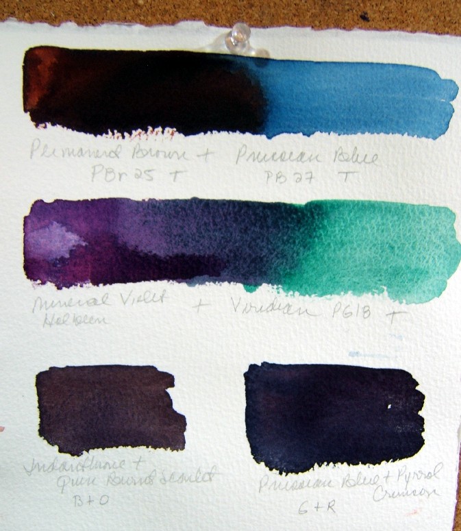
When asked, my beginning students asked about the possibility of having a lesson or two on how to get good, strong darks.  They are having trouble getting good darks and wondered how I do it.  So I did some color swatches and realized that the reason I get good darks is because I'm starting out with some pretty dark pigments!  I hadn't realized how dark my palette colors are - and all the colors I buy that aren't on my palette but are in my bag.  When you begin your color mixes with these colors, you can't help but get good dark greys and "blacks" of different temperatures!  Of course, I mixed colors to see what darks I could get and what variety I got, too - and that may be the lesson the students get.  I think they enjoy making swatches and I will contain it to just single pigment colors that are transparent or semi-transparent, so they don't have to worry about making mud.  (Almost all of my colors are transparent or semi-transparent.)

What's on your palette?  Dark colors, light colors, or a good mix of both?  Which colors are your favorite mixes for darks?  Here are some of mine I played with...


These were made by putting one color on the left side, one color on the right side, and then blending in the middle.  Sometimes one of the color was so pushy, it just took over the other side.  The Prussian Blue flowed right into the Pyrrol Crimson and then the blue side dried while the crimson side remained wet much longer, making that edge.  Other just flowed and remained in the middle.

The bottom mix is the traditional Burnt Umber + French Ultramarine Blue (both Daniel Smith colors).  I didn't care for what it did although it separated and granulated a lot but the mixed color is very dark and muddy looking to me.  But the Burnt Umber is pretty muddy looking.  I decided using the newer Transparent Brown color (which Christopher Leeper turned me on to in his workshop last fall) is a prettier pigment and a better mixer.


When I mix my colors, I always think about complementary colors and how they work together.  So when I have a reddish brown (Transparent Brown), I mix it with a greenish blue (Prussian Blue), thinking that the reddish brown is my "orange" and the greenish blue is my "blue" complementary colors.

The reddish violet then mixes with a greenish color (Viridian, a color I never use but looks pretty good mixed with this Mineral Violet from Holbein).

At the bottom, I mixed the two colors directly, putting them both down wet and brushing just enough to mix them.  So Indanthrone and Quinacridone Burnt Scarlet (another color I had yet to use!) makes a good grey-brown warm color while Prussian Blue and Pyrrol Crimson makes a good dark grey, almost black that looks cool to me. 

It's a fun process, without much stress involved, and you learn to renew your palette colors (Transparent Brown and Quin Burnt Scarlet and Pyrrol Crimson are all going on my palette now instead of in my bag) for the new year!

I hope when you click on the photos, they enlarge enough so you can read the colors well. 

Now on to painting a little black calf to try out those new mixes!

I hope you are safe and warm, wherever you are.  We are having our first real snowstorm of the year - supposed to get up to 4 inches today with a winter weather advisory from 7 am this morning to 7 am tomorrow morning!  Get out the shovels and snowshoes!!!


Thursday, January 31, 2013

THE LAST SWAN


In class Tuesday, I worked on this while my students were working on their paintings.  Two had already done the Notan study and then, using the photo and the study, they were painting their swans in whatever color they chose.  Since I had already done one in cool colors, I chose warms for this one. 

Since I only have 3 students, I can gear the lessons around what they want - if they have any ideas or suggestions.  When I asked if there was anything special they wanted to learn, they said they had a hard time getting their darks dark enough so would like to learn how to mix darks or what darks to use out of the tube.  That will be our next lesson and I'll be making charts of my darks out of the tube and mixed to give them some ideas.  Of course, it's all a matter of using a strong enough mix of pigment and water on the paper and not diluting it down too much - and not painting too dry so the paint won't flow.  It never hurts to return to the basics for me - to try out some new colors I have and see what they will do. 

Today is Maggie Latham's last day of her 31 Days of Colour.  If you haven't checked out her blog, go over there and gain some very valuable information, whether you're a beginning student or an old hand at watercolor!


Wednesday, January 30, 2013

ONE WORD WEDNESDAY


Filling

Photo by Jerry H. Carpenter

Tuesday, January 29, 2013

CHANGING COLORS


Another one painted just for fun and to see what I could intuitively come up with. 

I may have been thinking about family because I called this one
Blood Connections.


As you can see, I am not an abstract artist!

Monday, January 28, 2013

PLAYING WITH PAINT AND PAPER


For some reason, I always feel like I should paint something on my birthday.  I often paint it on the day - but not always. 

Anyway, just playing with paint and paper with no planning - just picking up a color I want to try and using another color with it and keeping it wet-in-wet with the paper almost pooling with water.  These don't look much like finished pieces - just paper on which I've moved some paint around.


This one looks a bit like winter trees in the wind.  Using Permanent Brown and Cobalt Teal Blue  with a little Shadow Violet mixed in. 


This one looks a bit like blue thistles.  Mainly using the same three colors.


Nothing to write home about!


I'm reading the Georgia O'Keeffe book now, enjoying the visit to New Mexico via her paintings and the photographs in the book.


Sunday, January 27, 2013

SUNDAY SHARING

Well, I've gotten behind with my Sunday Sharing = sharing bloggers who have become followers recently.  I will catch up, I promise.  But for now, you HAVE TO go to this man's site and see his work.  It is seriously clever and well drawn, too....His name is Charlie Layton and he is a professional illustrator.  These Freezer Friday drawings are done just for his own amusement (and now we get to share that).   

His excellent work makes me want to go back to drawing and practice more.  I've been thinking about picking up the guitar again, too.  Heaven knows I have the time.  I just don't have the inclination - or maybe it's a lack of determination.  I mean, I tell myself I'm too old to start this up again and start from scratch...but another year goes by and if I'd practiced for a year, I'd be able to play something!!! 


Saturday, January 26, 2013

MORE PRESENTS

My sister treated me to dinner last night and brought lots of presents for me, too!  She went overboard, as usual, spending too much, but she says I'm her only sister so...

Amid the fiction books and cd, I also got 2 art books (she checked my Amazon wish list and picked some good ones).


A beautiful hardbound book of O'Keeffe's landscapes in the place she loved - New Mexico.

The paintings are all oils, but they have the flowing look of some watercolors.  The book includes photos of the places alongside the way Ms. O'Keeffe saw them and her color choices. 


And a book put on my wish list when Maggie Latham recommended it.  (If you haven't been following Maggie's 31 Days of Color tutorial on her blog, you are missing some good stuff!


So I have enough to keep me busy while looking and reading through these two and perhaps even trying my hand at a few paintings as a way to study these two different artists.  But maybe not until I get past the last of the Notan studies coming for Tuesday's class...don't want to jump around too much.  Of course, you could say that painting on the front of the Rankin book is almost a Notan painting in itself!


Lately, I find I've been thinking about painting a lot more than painting.  I even had dreams that my body was being painted on and then that I was painting a triptych of 3 full size watercolor sheet paintings, one on top of the other.  Wonder what that means?


Friday, January 25, 2013

WHAT I GOT

Well, Roger Federer must not have gotten the message that what I wanted for my birthday was for him to win the Australian Open.  He lost in 5 sets to Andy Murray in the semi-finals :(  Boo hoo.  Next year, I'm going to have to send him an email ahead of time so he knows what I want for my birthday! ha ha

What I got for my birthday from Sweetie =
A new coffee maker which does not gurgle and glug and make a horrid sound when brewing.  It's still a Mr. Coffee brand, but a newer model and a different design.  I like it!
Plus
I got an old-fashioned, made in the USA, metal and glass gumball machine with a load of gumballs I put inside the globe.  :)   Yes, I guess, I am still a kid at heart and I won't tell you how old I will be tomorrow because, believe me, I feel older than dirt some days - no energy and no inspiration.  For those of you who are older than me, I get no sympathy (I know this).  For those of you who are younger than me, I'll try not to be jealous of your beauty and youth! ha ha
Plus
A new Louise Erdrich book I've been wanting to read.

Of course, my birthday is not until tomorrow but I'm still being taken out to dinner by my baby sister tonight.  I think Chinese is on the menu :)  I was invited out to lunch with my step-daughter, J., but the weather put the kibosh on that - freezing drizzle and snow caused this late morning/early afternoon to be a bit tricky to be out on the roads just for a lunch, so we postponed until...whenever. 
And my mother is making carrot cake cupcakes for me, instead of the huge carrot cake she usually makes so I can eat one, freeze a few, and save a few to eat later without thinking I need to eat it all.  My mother makes the very best carrot cake and fudge (peanut butter and chocolate).  It was her fudge and cookies that sent my gallbladder into overdrive after Christmas so I'll take it easy with the cake this time!

What is your favorite cake or dessert for birthdays?  I really love pie - pies of any kind (except strawberry - yuck!!!).  But homemade carrot cake is pretty darned good.

Are you having a birthday this month?  Next month? 
How do you feel about another year passing?  Are you reaching your goals (do you have goals, or are you like me and just flow with whatever comes along)?  Do you feel your age or do you feel younger inside? 
I hope you always feel young even if the mirror tells a different story!


Thursday, January 24, 2013

MORE STUDIES FOR CLASS


I did another sepia study in class, showing the students how to let the paint flow and use more water - this is something they both need to practice since they tend to paint dry, not incorporating the beauty of watercolor in their works.  I think it just stems from fear = they are afraid they will lose control if they don't paint with a lot of pigment and a little water - but that's the fun of watercolor! ha ha  Of course, I act like I've always known and done this - and I haven't!!  Something we all needed to learn as we learned more about watercolor, I think. 


Here is another one I did, using cool colors.  I thought about what colors I wanted first and still tried to paint it as loosely and fresh as the sepia one.  

I'll do another in warm colors, just for fun and to get more practice.  But I won't do the warm one until next class so I can show the students how going back to colors should be easier, after the Notan and sepia studies.


Wednesday, January 23, 2013

ONE WORD WEDNESDAY


Thanks

Photo by Jerry H. Carpenter


It is sooooo cold now.  I know the birds are thankful for their seeds and suet.  They need the energy to keep going during these cold winter days.  And I am thankful I can stand at my window and watch them every day.  A flash of red, or blue; the little round Carolina Wrens eating the dried mealworms (which were purchased for the bluebirds but too late to entice them to stay).  Funny bird antics every day is so much better than reality t.v.!!


Tuesday, January 22, 2013

FINISHING THE NOTAN STUDIES

Most of the time, when I am drawn to a painting, it is because of the strong values and then the colors.  If your values don't work, it doesn't matter how great your colors are.

As Hazel Soan says in her book, The Essence of Watercolor, "The hue of a colour may lead the heart, but the mind is persuaded by tone."

This is the swan finished by putting down limited colors over the sepia underpainting.    


I will do a complete painting, using color, next.  Hopefully, the Notan studies before painting will help me keep good darks and lights.  Hopefully, my students will enjoy this and learn from the lesson on Notan.

If you have problems getting your darks deep and rich enough, try this technique prior to painting and see if it helps.  As Red Green says, "We're all in this together."


Monday, January 21, 2013

NOTAN

I've been getting a lesson ready for my watercolor students on Notan, the Japanese design concept of light vs dark.  You can Google the word and find lots of information about it.  Basically, I want to have my students do this as a way to help them see their shapes and values/tones better before painting in color.  Of course, a few good value studies would do the same but you know how we often omit value studies and want to get right into painting!

Here are some steps in the process.  

Using a photo with good darks and lights, you then draw the subject, using a black marker or black ink or dark paint.  Everything comes down to 2 values at this stage - whites and blacks; there are no middle values.


(Trumpeter Swan photo by Yvonne Carter shared at WatercolorWorkshop)

You can use your photo manipulation program to intensity the darks and lights.

But it's better to do it yourself, using a dark marker or paint to create your own version of the photo in Notan.

Next, you draw or trace your photo onto your watercolor paper and, while looking at your photo and your Notan drawing/painting.  
Then paint your subject, using only one dark color.  

This one is on watercolor paper, using Sepia (Daniel Smith pigment).  I painted with a large wash brush until working on the smaller areas of the swan.  I liked the way this one turned out, very wet and juicy.

But that's not the end.  The next step is to paint this well with colors (perhaps a very limited palette).  

I did one a while back on Tyvek using a simple mix of colors to get darks, and bleeding out the medium values.  (I did not get good darks on the Tyvek and used a staining color so couldn't lift back to pure white - so I don't consider this one as successful as the one on watercolor paper.)  

I may give the students the option of painting one on Tyvek or Yupo (because you can lift out the whites if you lose them as long as you use nonstaining colors).  

But I'll ask them to do the monotone painting on watercolor paper.


Most of the time, when I am drawn to a painting, it is because of the strong values and then the colors.  If your values don't work, it doesn't matter how great your colors are.


Instead of starting over with the swan in color, I just put color over the sepia underpainting and here is the finished painting.


Saturday, January 19, 2013

GREENS AND BLUES


A bit looser, a bit bigger brush.  Easy to not draw anything here - in fact, what would you draw?

Friday, January 18, 2013

RED-BELLIED WOODPECKER


Again, in my Strathmore Visual Journal (9" x 12", 90# watercolor paper); another one without drawing before painting.  However, I think I'm getting too tight with these.  I need to stay loose and fresh - that is the goal.  So, instead of drawing with the rigger brush, I'll use a bigger brush and try to make more shapes.

I didn't paint yesterday - didn't do much of anything due to a flare-up of a gallbladder problem I was diagnosed with this month.  I tell you, it's all a straight run downhill after 50!!!  

Wednesday, January 16, 2013

ONE WORD WEDNESDAY


Visitors

Photo by Jerry H. Carpenter

Tuesday, January 15, 2013

WISHING YOU A BLUE BIRD


Another painting without drawing.  I'm enjoying this and hope I'm getting better - I'll know when I review it all next month and see if there has been any change.

This was one of the blue jays on a post near the suet feeder.  I saw a blue jay yesterday that was so big I told Sweetie, "I think that jay ate all the other jays!" because we aren't seeing as many as we used to see around the feeders.

Monday, January 14, 2013

NO DRAWING


Another watercolor sketch/painting done with no prior drawing - in my Strathmore Visual Journal (90#).  I have the 140# journal, too, but I think this lighter weight paper doesn't take much working so it's easy to overwork.  Knowing that, I try to get the colors and shapes down in 2-3 passes and no more.  You can lift a little but not much. 

The goal for these paintings without drawing is to lighten up, get to a point where I will not overwork a piece so much, and to help me slow down and see shapes and values better.  

This was a pretty convoluted photo I used and I don't think I got the greens or the shapes varied enough in this one. 

Still working on this challenge for myself - at least throughout the month of January.

What are you working on this year?  What challenges or goals have you set for yourself?

Saturday, January 12, 2013

WORK AROUND A BLOGGER GREMLIN

This is just a test to see if I can upload photos using Google Chrome on my laptop....


Yes, I can!  (I didn't think it worked when I tried it before, but it was my mistake - I was waiting for another screen to come up before putting in my photo info.)

So, it does work.  Just means I either have to install Chrome on the desktop
or I have to move photos from the desktop to the laptop more often. 
But it does work (and I've read that switching from HTML to Compose often causes problems, too, so I don't want to keep doing that on the desktop and then create other problems).

This is an old photo I have on my laptop - but we are having a wet end-of-week with mixed showers and thunderstorms, along with freakishly warm weather (65F in January ?!?) so it works as a current photo for several wet and stormy days which began Wednesday.