Saturday, September 18, 2010

NEW TOYS + DVD OF JOSEPH ZBUKVIC

Before going on the extended vacation, I had received some new toys in the mail.  I tried out the Neocolor II watercolor crayons and made a test sheet (on yupo so the color is pretty bright and clear) of each color.  Thought you might like to see what comes in the box of 30.


If you buy these, make sure you get the watersoluble ones - they call them wax crayons but the Neocolor I series is actually wax and can't be thinned or worked with water - only turps.


I'm happy with the variety of colors in the box and think 30 of these will do the trick.  They do have them in boxes of 50, I think.


While Jerry had his photo group over for their monthly meeting, I watched one of my new DVDS:  Joseph Zbukvic's "Watercolor Impressions" from The Artist's Place (http://www.artist-videos.com/).

In the DVD, Joseph paints 3 paintings and one small watercolor sketch - all on site.  We get a painting from a Melbourne harbor, a busy Melbourne street scene, and then he travels to Venice to show us a sketch of a fish market and a painting along the canal. 

As he paints, he talks about his work and his process, and you get to see how he works his paper, paint and brush, with lots of calligraphic lines and squiggles (that he calls the jewelry of the painting).


Joseph lays out his palette, not really concerning himself with specific colors, but knowing that his cool colors are on one side and his warm colors on the opposite side.  He paints according to these questions he asks himself:

1.  Is it dark?  Is it light?
2.  Is it cool?  Is it warm?

He limits his color use and often only uses 3-5 colors in his palette.


The scene shows the harbor where he sat and sketched and then painted.  Not much sunshine there, but he often paints grey scenes that have little bits of color here and there.
He always looks at things he's painting as shapes and he looks at the shapes in terms of tone (what I call value).  He uses Saunders rough 300# watercolor paper, getting some "staccatto" steps in his painting due to the rough texture of the paper.

He almost always adds people in his paintings, moving them where they look the best in the finished painting, not necessarily sticking to what he sees in front of him as he paints.  He prewets some areas and paints some areas wet on dry, using round brushes.  He often tells his students, "Never state.  Always indicate."  Meaning, don't get too caught up in the details - hint at things in the background and use the calligraphic marks that makes your work uniquely your own.  Always keep an eye on the whole painting while working.

Joseph says tone (value) is your number 1 weapon in creating the illusion of depth.

Connect your shapes!  Don't have separate shapes all over the painting and don't fill in every shape completely but leave some whites by using a staccato touch with your brush, dancing over the paper.  Filling everything in is boring.  Using round brushes that are not soft but springy, allows you to "draw" with the brush when it comes down to putting in the "jewelry" of the painting.

Joseph says you should always try to convey the message of the scene.  It doesn't have to be completely accurate so think as you're painting - will that look better if I moved it over there, or put a person here...

He does use white gouache sparingly to bring back whites he's lose.  He's very careful to use it in small areas.


1.  The Melbourne scene as Joseph sketched and painted it.
2.  The closeup showing how he adds people to the scene.
3.  And the final painting. 


This should whet your appetite for more.  The DVD is definitely worth the price and it was delivered very quickly after ordering. 

Joseph offers workshops all over the world - but his workshops sell out quickly!  So check out his website and see if he'll be in your area next year.  I think he'd be amazing as a teacher and wish he lived closer than Melbourne!

(The DVD has a scene in Venice along the canal.  Joseph sets up and then deals with a huge amount of problems - a garbage boat parks in front of his boat he was going to paint, the water is rising and starting to flood the walk where he's set up, the noise of the garbage boat as it continues to stay and load garbage all through the scene - and yet he handles it with great grace and just keeps working, using his experience to be able to make a beautiful painting out of what would have given most of us a case of the weepies where we'd have packed up our things and gone home.)

And maybe this weekend, I'll get to do some painting of my own!

Friday, September 17, 2010

DON'T PET THE BEARS

After leaving the town of West Yellowstone early in the morning on our last day touring, we drove until we got into Idaho again and stopped at Yellowstone Bear World.  We were not going to pay and drive around - the guy at the entrance made it sound like:  No stopping, no rolling down your windows, no messing with those rules or we'll kick you out.  However, we stopped at the gift shop before leaving and went in, looked around, found out they had bear cubs in the back along with hot drinks (it was COLD!!!) and restrooms.  So we went behind the gift shop and began looking.  Bear cubs and a petting zoo that looked pretty cool and photo-worthy. 

The male cubs were born in January - so were 8 months' old.  They were big enough to cause problems if you weren't feeding them correctly, grabbing and chewing on your coat or shoes.  I didn't feed them but watched them before and after their feeding for a while, went inside to warm up, and went back out to watch some more.  They were rough with each other, tussling and rolling around but no growling.


These were all male black bear cubs.  Did you know that black bears come in 3 colors - black, brown and cinnamon?  I didn't.


Do not rub their bellies - it's a trick!!


My sister loves bears - so I took a lot of the photos for her.

After we spent a couple of hours there, we did do the drive-through and saw the big, black, male bears and realized why they don't want you to roll down your window or stop more than a second or two - they could come right up to your vehicle and you don't want a big black bear trying to get into your car!!

The wolves were not scary - but there were only 3 of them along the road and this guy decided he might like to bite a tire or two...


But then, a long drive back to Salt Lake City. These are mountains in Utah as we drove along. Back to warmer weather - in the 90'sF again in SLC - and even drier air (ouch, my nose and sinuses!!).


So for this trip we drove miles through parts of Utah, Wyoming, Montana, and Idaho and spent almost every night somewhere new.  No wonder it felt so good to get back to our own home and sleep in our own bed after 9 days + nights away!

THOMAS MORAN: PAINTER OF YELLOWSTONE

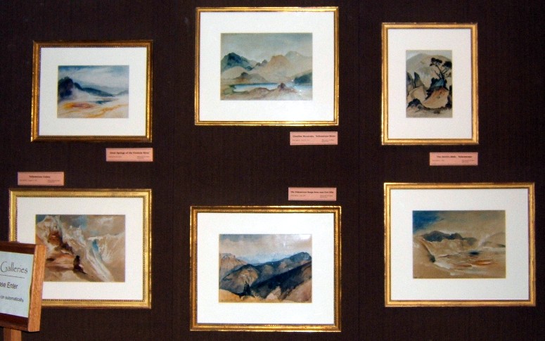
About a week before we left for our trip to Yellowstone, I saw a program about the artist, Thomas Moran.  He travelled to Yellowstone to document, in watercolor sketches, the unbelievable beauty of the region.  Along with photographer, William Henry Jackson, they gave our government documented proof of the wild stories of erupting geysers and pools of gold and blue the early settlers had talked about.  Because of Moran and Jackson, Congress established Yellowstone as the world's first national park in 1872. 


In Mammoth Hot Springs, in the Albright Visitor Center, there is a permanent display of some of Moran's watercolors and Jackson's photographs.  They are displayed in a very dark area (to keep the colors from fading).  I enjoyed seeing the sights as they looked when Moran saw them in 1871-1872 - and then compared those sights with the way they looked as we travelled to some of those same sights.


I picked up a couple of postcards - which were highly saturated - to have a souvenir of his work.  Can you imagine going to some place wild and undocumented and being the one to return with work to show what you've seen?  If I remember the program correctly, he was the first artist to sell a painting to be displayed in the halls of Congress - an oil painting of a waterfall in Yellowstone.


Thursday, September 16, 2010

MAMMOTH HOT SPRINGS


Leaving Old Faithful Inn and their bison (yes, he is in the parking lot area) behind, we did more sightseeing of the park, heading north.

Old Faithful Inn was built in the winter of 1903-1904.  The chimney lobby is formed by 500 tons of hand quarried lava block, stands 80 feet high and has 8 fireplaces!  They do things big in the west!


Mammoth Hot Springs (Lower and Upper Terraces) is one of the best examples of travertine-depositing hot springs.  The Shoshone and Bannock tribes collected minerals from MHS for white paint.  The color you see is created by thermophiles (heat-loving microorganisms) living in the hot water flows.  The hottest water and heat-loving thermophiles create the colorless and yellow colors while the orange, brown and green thermophiles live in the cooler water.


Living sculpture!


The weather turned colder. Rainy, cloudy skies, colder temperatures had us layering our clothes and hoodies, putting on gloves and hats and spending time warming up in the car in between walks.


Desolate beauty.  The trees leached up the poisonous minerals until they had "bobby-socks" feet, white-washed and pale as winter.  Eventually, wind and snow toppled them.  The landscape was littered with remains which looked like dry, white bones scattered under trees which had yet to fall.  


GRAND TETONS + YELLOWSTONE


The Teton Range rises abruptly from the Jackson Hole valley, provoking feelings of insignificance.  I cannot imagine the early settlers in this wild, open country.  It was a beautiful blue sky day without a cloud in the sky - and, yes, the sky is that blue!  The air was clean and dry and about 25F cooler than when we left the heat of Salt Lake City.  We drove around, stopped, parked, walked and took photos here and there.  This is, apparently, the iconic image that transfixed Ansel Adams. 


From sagebrush flats to wet meadows and lakes and ponds, Grand Teton National Park has it all.  It was a beautiful place. 

Along the way we stopped at a place called Mormon Row  where an old farmstead still stood and a bison herd roamed freely.  No fences, no wires, just the herd walking from place to place and people stopping to take photos (from a safe distance away, hopefully).


This guy was on the side of the road and I snapped him as we stopped for several crossing in front of a few cars.  They seem to gentle but occasionally look at you with a beady eye and snort to tell you this is not a petting zoo and don't be stupid enough to think you can get closer to me without a car in between us.

Have you seen Old Faithful erupt?  Apparently, it does so with such regularity the park service posts the times in the Old Faithful Inn.  Dozens of people sit on the balcony facing the geyser and wait, drink in hand, making it a party atmosphere.  That's if you don't want to go ahead and walk the few yards from the hotel to the geyser, sit on the benches there, and wait.

Jerry and I took the long walk along the boardwalk the next morning, after spending the night in the Old Faithful Inn (no t.v., no internet access: it was like all you were supposed to do was walk around the look at geysers and sulfurous pools! ha ha).  A nice, brisk walk with just a few other hardy souls out that morning as we walked past Old Faithful, Castle Geyser, and on to Morning Glory Pool. 

When it was first discovered and documented, Morning Glory Pool was a cobalt blue color - the hottest of the lava/water mixes produce the bluer colors in the pools.  So they called it Morning Glory for what it most resembled.  Since that time (1871), people visiting have thrown coins and other junk in it, clogging the vents and making it look more green in the center and cooling on the outside to an orange and brown color.

A brisk walk back, breakfast at the Inn, and we were on our way through Yellowstone Park up towards the northern entrance to Mammoth Hot Springs.

Come back again to see more photos from the trip until I get back to painting (first the laundry, grocery, house cleaning, shopping for shoes - for a party Saturday, petting the cat, etc.).  But I'm thinking about Nick Simmons and his comment of wanting to see some serious watercolor acreage...couldn't ask for more acreage than what's in some of my Yellowstone photos so maybe that will make it's way onto a large sheet?

Wednesday, September 15, 2010

SEPTEMBER TRIPPIN' - ON THE WAY TO YELLOWSTONE

We began our journey at Salt Lake City, UT - staying with Jerry's sister for a couple of days and visiting family.  Then on the road in our rental - a Kia that definitely pulled to the right and only felt smoothe if you were going over 75.  As the Utah and Wyoming interestates are marked for 75, no problem!

Our first stop, after a 5 hour drive with miles of nothing but sagebrush and mountains and ranches miles apart, was in Jackson Hole, WY.  Stayed in that TTOS (Tourist Town on Steriods) overnight before heading out again the next morning on our way to Old Faithful Inn.

Jackson Hole is like Gatlinburg, TN - only twice the cost.  Art galleries selling paintings for more than you paid for you car are common.  Very few watercolors, but I did see some Dean Mitchell and some David Drummond watercolors - about 1/2 sheet matted and framed for a DM would cost you about $8-12 K while a very small postcard-sized David Drummond was going for $400.  Pretty steep compared to what things sell for around here but, then, you're in Jackson Hole!  The best thing about the place, other than seeing some watercolors and some truly gorgeous and boldly colored acrylics in the galleries, was the ravens in the town center.  I didn't get a good photo, though, because it was cloudy and threatening to rain - a good day for ravens but not for photography on the fly (Jerry didn't stop but had me take the photos out the window as he was looking for a place to eat). 


Also...on the way out of town we stopped at the National Museum of Wildlife Art.  Fantastic place on a hill overlooking an elk refuge where the elk and bison come down from the mountains in the fall and spend the winter around the area.  


The Wildlife Museum was home to artwork by John J. Audubon, Robert Bateman, Albert Bierstadt, George Catlin, William Merritt Chase, and Georgia O'Keeffe.  But the best part, for me, was finding two full gallery rooms full of paintings there for a silent auction.  They were local artists who had their paintings for sale with 1/2 the proceeds going to the museum - and there were some gorgeous pieces there, many in watercolor.  We weren't allowed to take photos, though, and a docent followed me around and talked about the local artists.  I especially fell in love with artwork by September Vray and Nancy Dunlop Cawdrey.  (Can't find a link for September Vray but her work was stunning - small, lots of white, powerful, meditative).


The Museum entrance was huge - these gigantic lodge poles - ubiquitous in the western US - with many sculptures of bears, elk, bison and other critters outside around the grounds. 

Of course, as we left we were heading towards the Grand Tetons and the beauty of the plains - I kept thinking of "amber waves of grain" as we drove along miles and miles toward the southern entrance of Yellowstone and on towards Old Faithful Inn.  (When we came to the southern entrance of Yellowstone I was surprised that we were just entering the park!!  No wonder the roads are posted as 75 or 65 unless there is construction - if they weren't, it would take you days to get anywhere in the big, wide open west!

Come back tomorrow to see day two - have you seen Old Faithful?

Monday, September 13, 2010

BACK FROM DRIER WORLD

Well, you might have noticed I wasn't posting as much or commenting as quickly.  Why?  Because we were taking a pretty long trip away to what the locals like to call Big Sky Country and what I call Drier World.  I swear I could not breathe easily the whole time - not the elevation (in the Grand Tetons and Yellowstone and Mammoth Hot Springs) but the dry air.  I've never experienced such dry air!!!  I'm not sure I could live there - but, of course, the landscape was gorgeous and there will be plenty of photos to come :)

So stay tuned for photos of greysers, sulfur pools, terraced springs, and bison, bear and elk...

Thursday, September 9, 2010

OKAY, ONCE MORE WITH FEELING!

Here we go again.  Another try at the deck chairs and shadows. 


Full sheet Arches 140# cold press watercolor paper, Daniel Smith paints.


Give me your best shot:  what works, what doesn't and what do you think about the ROYGBIV-like chairs?

Sunday, September 5, 2010

NEW TOOLS AND NEW TOYS

Got a small order from Cheap Joe's the other day - it's fun to have new tools. 


And then got my DVD order from The Artist's Place - quick delivery!  It's also fun and educational to watch watercolor masters at work.  One from Joseph Zbukvic and one from Hazel Soan.  Both of these artists know what makes watercolor so breathtakingly beautiful...and they know how to paint scenes that make you want to either give up completely OR dig in and try harder and spend more time with a brush in your hand.


I may just be too busy to post for a few days!

Friday, September 3, 2010

LUCKY NUMBERS WIP 3

A bit more work, bringing in the background area and merging it with the faces a bit.  So, at this stage I need to think about how dark I want to go with the background (darker than it is) and how light I want to keep the skintones...

I DON'T SPEAK SPANISH

But I wish I did.  Maybe I can still learn?  Why?  Well, then I'd be able to read what this artist is saying about his work.  Take a look at it and be prepared.  THIS is the kind of art that blows my skirt up and makes me want to shout halleleujah!!!  FINE art, a mastery of the watercolor medium.  WOW!

http://antoniosolera.blogspot.com/

He just became a follower of mine (yes, I often check out who is following that isn't already on my sidebar so I find new artists around the world), and I don't know why, but I'm honored that he wants to know what I've been up to.  Again...WOW!

And this artist:  http://oncoy.blogspot.com/ who I found on Antonio's sidebar.  OMG.  And that says it all. 

I'm off to find my old Spanish language cds and try again.  This stuff is totally beyond me.  I don't even think I could get there in my lifetime.

Get a cup or glass of your favorite drink, sit back and prepare to be amazed by these two artists.

Thursday, September 2, 2010

LUCKY NUMBERS - WIP 2

Started working on Jenny now that Chris has some color to him.  Going slowly.  I'd really like to nail this one so lots of time walking away and doing something else, then returning to look at it again and decide what's working and what to do next to fix something that isn't working. 


I got rid of Curious George on Jenny's teeshirt and am going to give her a limey-green color instead.  I really like the shades and the way they are looking so far.

Tuesday, August 31, 2010

MAMA SAID THERE'D BE DAYS LIKE THIS - WIP

While letting the portrait of Jen and Chris sit and simmer (as opposed to rushing in and ruining it), I'm doing 2 other things.  Here is one...


Yep, it's a sewer grate.  The photo was taken at the Cincinnati Zoo.  I thought it would make an interesting painting.  Odd, I know, but I'm not the only one who thinks such things would make interesting paintings.  We artists are a strange bunch and find beauty in things most people wouldn't even notice, right?  And they may be disappearing...police recently captured 2 men who were stealing sewer grates and selling them for scrap.  I guess there is copper in them and nothing made of copper is safe.  Of course, the business that bought the grates (25 in all!!!!) weren't punished.

I began it by just splattering and throwing masking fluid/miskit around and then doing the same with the first bits of color (after drawing in the grate, of course.


Slowly building up color and shape and trying to get the little sections to read more depressed into the sidewalk (no, it wasn't blue and violet but I used my artistic license to change the coloring - you can do that, you know.)


The splattering of masking fluid and paint helped to loosen me up when I was getting tight with the portraits (yes, I'm still working on the Lucky Numbers portraits...slowly but surely.  I've found I really have to be in a positive mood to do a portrait.)


Calling this one:  Mama Said There'd Be Days Like This. 
(Wonder if that's what the sewer grate thieves are saying now that they are behind bars?  Hope the bars aren't made of copper!)

GCWS GUEST ARTIST: NITA LELAND

The Greater Cincinnati Watercolor Society is having Nita Leland visit us tomorrow during our 10 am - 1 pm meeting.  She'll be giving a painting demo and will talk about her art.  It should be colorful and fun.  Come on by if you're in the area.  If not, check out Nita's website - all about color and tons of information there.

Nita is also the judge for the upcoming Cincinnati Art Club Viewpoint show - due date for entries is over, I'm afraid.  I put 3 entries in with the hope that 1 will make it in the show but as Forrest's mama said, "Life is like a box of chocolates...you never know what you're gonna get." 

Ummm...chocolates...no wonder I'm gaining weight instead of losing the few pounds I want to shed!

Monday, August 30, 2010

ART, HUMOR AND TRUTH: DANNY GREGORY

Go to this post. 
http://www.dannygregory.com/
and on his right sidebar read the posting titled You Suck...

Read it.  Laugh.  Soooo true!

Now, doesn't that make you feel more free when it comes to wondering what others think about your work? ha ha  When I give someone a critique (either asked for or totally unsolicited), I'm always worried that they will only hear the "bad" stuff and not focus on the good.  I shouldn't worry, right?  And when someone tells me they don't like what I've painted without giving me a constructive reason, I should ignore it, right?  So should you!

I love Danny Gregory's art and humor.  I had him on my blogroll at one time, but being the fickle thing I am, he disappeared in a housecleaning frenzy one day.  He's back.

I've been doing some sorting, rearranging and adding to the sidebar - lots more there.  Of course, being the fickle thing I am, if I find myself not taking the time to visit often, I'll make changes.  It's just the way I roll...

But enough about me!!!  How many of you have that Bobby McFerrin song in your head right now?

"Don't worry.  Be happy."

Sunday, August 29, 2010

PORTRAIT 5 - LUCKY NUMBERS (WIP)

From a photo taken at River Downs racetrack on Jerry's birthday, I singled out Jenny and Chris for this one.  I did the light sketch on tracing paper and then went over the tracing outlines with black marker so it would easy to trace onto the watercolor paper.


Traced it, trying to fix Chris' mouth that got too wonky in the first sketch, and make any minor adjustments while looking at the photo again.

I'm calling it Lucky Numbers (you can see all the numbers of the seats behind the two of them in a field of black - which should work well in the painting).  I like Jenny's cool shades, too.  Chris had on a black and grey shirt and Jenny had a tee-shirt on with Curious George on it.  Think I'll change that and give her a color that pops a bit more...we'll see.


Again, the test is to keep it light - don't lose all the lights - let the brush dance over the features, not smoosh them into oblivion.  If it works, this will be Portrait 5?  (This is on 1/2 sheet Arches 140# cold press watercolor paper.)

Saturday, August 28, 2010

ART MAGAZINES

To read or not to read them...do they help or hinder?  Do they give me inspiration or make me feel like giving up because I've gotten such a late start and feel that I don't have enough time?

What's your take on them?  Which ones are your favorites that you couldn't do without?

Whatever it is, my friend Nick Simmons clued me in on a British artist, David Poxon, who just happens to have a nice feature spread in the latest  (October 2010) Watercolor Artist magazine.  (The magazine has a lot of good stuff, including an article I really enjoyed about Aussie artist Charles Sluga).

Mr. Poxon paints old wooden doors, rusty hinges and railroad ties, old pots and pieces of metal that have been weathered for years.  He is making a statement about the industrial aspects of life and how they are fading, rusting away.  Looking at his paintings, you'd think, "Great color, beautifully rendered textured pieces."  He wants you to connect with the souls of the things he paints...those things that are fading away (so isn't it good that he's saving them for us in his paintings). 

Mr. Poxon is a late bloomer, too.  Although he wanted to be an artist for decades, he spent his years doing something else for someone else and didn't go full force into painting until his retirement.  (So many artists have taken this well-worn path after raising a family, retiring from a career, etc.)  David is now getting the recognition he deserves and switches from painting larger paintings (27" x 36") to doing smaller ones of 12" x 12" (for the break they give him after completing a large one). 

I was disappointed that the writer of the article didn't list David's URL so we can go and see more but I'll give it to you here...
http://www.davidpoxon.co.uk/

Go visit and enjoy, unless you're of the belief that you shouldn't view others' work all the time because it influences your own too much :)  I waffle back and forth between thinking both ways, and cannot make up my mind if it's a good thing or a bad thing to surround myself with artwork from others (in paintings I have on my walls, in magazines and on blogs I visit).

Friday, August 27, 2010

TWISTED - WIP

Returning to another fluid acrylic painting that was started and fizzled out without going anywhere.  This poor thing hung on my basement/garage wall for a long time - well, a long time for me!


After looking at it each time I walked by it, without much inspiration, I finally took it off the wall and into my little art room (just enough room on my table for it since it is a full sheet watercolor paper - hotpress), and fiddled around, hoping to feed off the inspiration from the heart lock/locked heart painting.


Although I had no real direction, I knew I wanted to add some blues and greens to the shape (is it a shell? don't know, although it's shell-like).


I played up the color on the main shape, then ran masking fluid over the background (brushstrokes of miskit, and splatters).  Then I  really played with the color in the background. 

The masking fluid is still on and it's drying.  We'll see what happens when I remove the dried masking fluid!  I'm thinking the words are a mistake...maybe need to be covered over partially...we'll see. 

This one was a bit of fun and pure experimentation. 


I saw the movie, Local Color, today.  From 2006, it's about a young artist searching for a mentor and finding it - in a cranky, alcoholic, opinionated, mean, disappointed, old  Russian painter.  Supposedly a semi-autobiography of the writer/director who is also an artist, George Gallo.  It's worth watching.  An artist would enjoy it for the "pearls of wisdom" the old painter bestows on the young man - while making him paint his porch, wallpaper his bedroom, etc...  Of course, eventually the young man wears him down and they become friends and the old Russian does teach him directly.   The scene where the Russian shows the art gallery/critic work of a new "modern" artist is fantastic - we've all thought it! 
http://www.imdb.com/title/tt0472126/

Thursday, August 26, 2010

LOCKED HEART OR HEART LOCK

This was done in fluid acrylics at one of Deb Ward's weekend workshops months ago.  I got so far and then didn't think it was finished but didn't know what to do. 

The other day, after chatting via email to an artist friend who has ideas about art I'd never have in my midwest traditional thought processes, I went down to my art room and took this one back out and knew what to do.  I covered the lock completely with masking fluid and then pinned it to my corkboard and had fun wetting and drizzling and spraying the colors to make the wooden boards in back of the lock.  It needs some minor touch-up now but I feel it's more finished.  And pushing that wood back with more muted colors and layers made it pop even more.