Tinna asked about the Inking Palette overlays I did a while back...
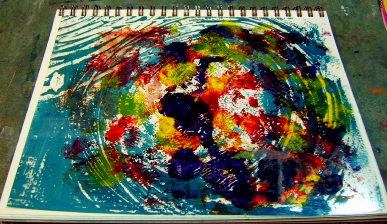
Here is what the palette looks like - the photo shows the white paper torn from the plastic palette and the info about the inking palette. They come in a pad with white tissue paper in between each plastic sheet. Pull them apart, remove the tissue, and use the inking palette for acrylics.
When you paint using it as an inking palette, you get leftover acrylic paint that you can let dry on the plastic palette - and since it's see-through, you can glue it down over something else to get...something else! haha
This piece of the plastic inking palette (with a bit of dried acrylic on it) could be trimmed down and glued over the white paper in my watercolor journal - or over a "failed" painting on paper. It could add interest into a painting that needs something else to make it more interesting.
What about this sheet over a very dark sea turtle (made with the Kathleen Conover gesso juice and Mary Beth Shaw stencil technique mentioned last post)?? Pretty dark...maybe need to brighten the turtle a bit more...
Anyway, this is just to show you how you can use these sheets - rather than throw them away with the garbage.
(Hope you see this, Tinna, and that it helps you understand the process a bit more. I think the plastic inking sheet works best over something lighter in the background/underneath so a light painting or drawing would work best.)
Kathleen Conover is coming to the Middletown Arts Center (Middletown, OH) to give a talk and then a 4-day workshop. I will not be going. But it did make me pull up a YouTube video of her doing something with her "gesso juice" patterned background as a start. So I tried it.
You dab the gesso juice (a mix of white gesso, acrylic matte medium and water) on a piece of watercolor paper using a soft makeup sponge over a stencil. Let that dry and then paint as you usually do with watercolors. The watercolors go over the plain watercolor paper differently than they do over the gessoed parts. Interesting textural background to start. I used a MaryBeth Shaw stencil of trees - and what goes good with trees = Crows, of course!
In hindsight, I wish I had done the legs and talons differently, having them grasp the trees (which became reeds in this painting because the crow was so big). Maybe will try this again. I certainly made enough gesso juice to do a lot more. Was going to show this to my class but they didn't seem very interested in working with a patterned background. Oh, well, every technique cannot be a winner. And I think this may work better with a bolder stencil (Kathleen uses large blocks in her video) and cutting around them with color. She also paints her stenciled paper in a medium to dark value and then draws her object on with white chalk.
The acrylic on paper painting I did a while back was not making me happy.
Too blah. Nothing to make anyone want to look at it.
So I went back with oil pastels and my fingers and made changes.
Hmmm...still missing any pop or interest.
Maybe this one is going in the trash.
I did play around with some other things - just a bit of this and that...
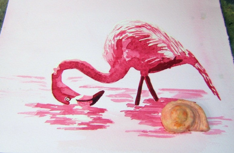
A pink flamingo using just one color = Permanent Alizarin Crimson.
On a scrap sheet of Arches 140# cold press paper. The seashell is a molded shell out of paper (like you use to make your own paper with a blender and a screen - I used a cookie mold and filled it with the paper pulp and let it dry).
The crow was a print I trimmed around, then added the heart (made by using texture medium in the shape of a heart, letting that dry on the paper and then painting inside it; letting that dry and cutting around it, punching a hole and adding the string).
This one may become a birthday card for my Sweetie - who has a birthday in August :)
Speaking of birthdays, I just got an order from DickBlick.com that included blank Watercolor cards, blank Printmaking cards and blank Mixed Media cards - so I can make tons of cards for birthdays coming up and for the rest of the year - and then some!
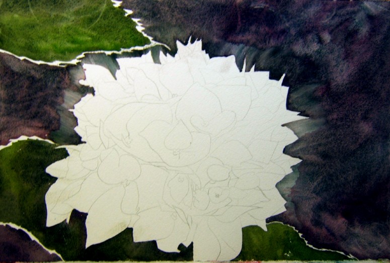
Meanwhile, my full sheet hydrangea is sitting waiting for me to finish it and I just do other things instead - can you say displacement behavior??? ha ha
In the latest Watercolor Artist magazine (the European one), there was an article about an artist named LaFe who paints without drawing - mostly flowers.
I thought I'd try it.
It really makes you slow down and look and look and look closely. I started in the center darks, put in the darks first, and then the wet colors around. Last = the background which then brought the lights up around the flower.
Of course, now that I look at it I see the green leaves are pretty tiny compared to the flower - but that can be fixed...
When working in acrylics, I put my pigments out on Grafix Inking Palette, which is a plastic sheet. I have a pad of 9 x 12 inch sheets (25 sheets in a pad). When I'm finished working on the prints and other things, there is a remainder of the acrylic on the plastic sheet. I keep them because they are pretty, but didn't know what to do with them...now I think I have a new idea for their use.
Using Matte Medium, I glue them down to a piece of white printmaking or watercolor paper.
Putting them over a drawing works pretty well so it shows through and the color is added.
The top two are glued down over drawings. The third is just a lpiece laid on top of my watercolor journal.
Another water lily painting using the Elegant Writer technique where you draw around the subject with the Elegant Writer and bleed that out using just water and a soft brush. Then you add watercolor.
The first one, I left the lily white. This time I bled out the Elegant Writer pen marks and added a touch of violet.
The students finished their paintings today, using this technique.
Some things that may become collage pieces...or not...
Acrylic paint, fluid acrylics, oil pastels, etc., on fairly thin paper (Strathmore Windpower Drawing paper, 80#)
This one reminds me of
Looking in Other People's Windows.
And this one says to me,
Don't Fence Me In.
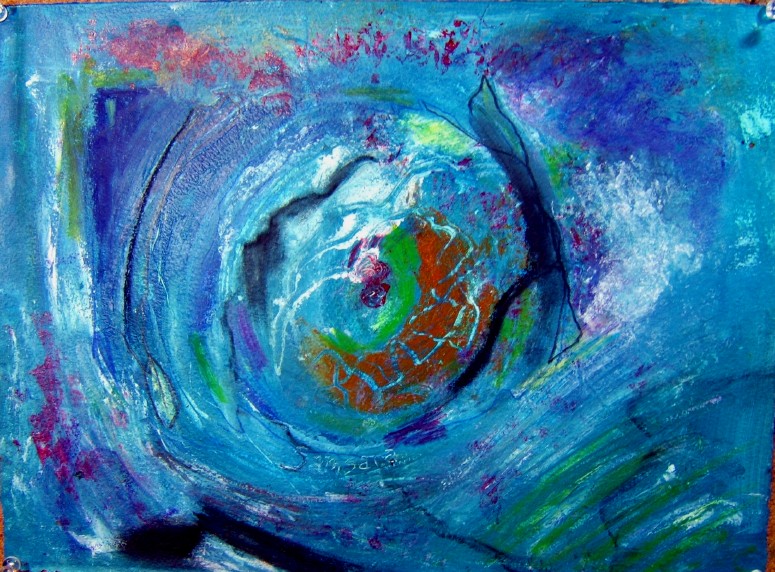
This one is fluid acrylics and other things (oil pastel, watercolor crayon and pencils, white gesso, etc.) on fourth sheet (11 x 15 inches) Arches 140# hot press paper.
Thinking about
The Circle of Samsara
which is what Buddhists call this life and all our patterns we escalate or de-escalate.
And this is just a journal entry, trying hard to go with the flow - now isn't that a typical human response to relaxing??? Instead of going, letting go, releasing and relaxing, we have to TRY HARD to do it right! ha ha
Gessoed partially over a prior entry in the sketchbook/journal - then used watercolor ink, fluid acrylics, white gesso and gouache and opaque watercolors to get to this.
This is not finished yet, but it's getting closer...
And the title?
Fireworks in July Hydrangea
Full sheet (22 x 30 inches)
Arches 300# cold press paper
Daniel Smith and Holbein paints
I'll deal with the fiddly bits in the center, bringing the yellow petals out a bit more and giving them the centers.
Adding the yellow (Hansa Yellow Light which looks a bit greenish - more so than the Azo Yellow I had on my palette).
By adding the bright yellow, it changed the look of the whole thing as far as the photo is concerned = it looks more warm now overall. I'll be slowly adding the petals, one by one, as I move through this one. It will be slow going, I'm sure.
So the actual painting is somewhere in between the top and bottom photos...the background is Moonglow + Zoisite Genuine (a dark dark green) so a deep purple with cerulean and pinks coming out in the wet-in-wet plus the deep granulating green-brown. Strange how different these two look. Guess I'll get a true photo when it's more finished.
Two shows are coming up soon, and I'm not even sure I'm going to enter either one. If I do want one or two in the show in August, I have to get something to the framer's shop.
From a reference photo of my hydrangea as it bloomed by the doorway...
Using Moonglow + Zoisite Genuine in the background with Zoisite Genunite + Sap Green for the leaves. I think I'll play the granulating/texture look of the background against the smooth look of the petals in this one. Look for lots of blues with just a touch of violet or pink :)
This is a half sheet, Arches 300# cold press. Daniel Smith colors.
I will soften those hard edges when I add more paint and give the outside edges a little pop of color.
This one has a name already (sometimes they just come so easily and other times it's a struggle!)...but I'll save that until it's more finished...
It's hard to get a good photo of the Moonglow + Zoisite Genuine in the background but this is pretty close.
On Tuesday I had three students. I showed them how to use The Elegant Writer pen to outline their drawing and then bleed it out before adding color. All three students did really well with three very different photos/paintings. Unfortunately, I didn't take a photo of them. I will try to do that next time when they return to finish their paintings.
My finished one on a fourth sheet of Arches 300# cold press paper. (While the lily pads are accurate, in color, the water is more dark green and violet - sometimes the camera just does not get the right colors no matter how much I manipulate the white balance while shooting the photo.)
I have another started on Arches 140# hot press, going to see if it makes a difference what kind of paper you use for this technique.
More steps in the acrylic on canvas...
If Crow is creating the World, then there must be some explosions and violent colors, right?
But Crow, as the Creator, has to stand out - she can't just blend into the Universe! So...above and below colors and shapes with darker Crow colors...
A little micacious iron oxide to add depth to those feathers but still keep some color there...
Now what? Where do I go from here?
Too static - get rid of one of the orbs or add another? Lighten around the crow? More thinking and waiting on this one to come together.
And now the name changes to
Crow Captured all the Colors and Created the World
But it's not finished...maybe some words? With this type of creating, you can just go on and on and on...letting it sit a few days may be the best thing for this one.
There are a lot of Celtic and Native American creation stories about Raven or about how Crow was white and became Black...I could add something of that in...
For now, it will sit and wait and I'll glance at it each time I enter my little art room and some day Crow will tell me what to do with this one.
Crows are never considered harbingers of death or sorrow in Native thoughts and lives. Crow's intelligence is admired and there are tribes with Crow Clans. Crow is the messenger between life and death, between right and wrong. Listen to Crow if he calls you, because he is calling you to be smart and make a good choice, not a bad one. Or he is telling you someone from the other side is trying to send you a message. If Crow is your Totem Animal, you are smart, you think things through, but you sometimes see things in black and white. You also are more aware of the bigger picture and can sense more than with just your 5 senses.
***How Crow became black (from a Lakota story)***
Now, in the past, Crow was white. He was a friend of Buffalo and warned him and his herd whenever he was being hunted. He would fly high above and watch out for hunters. Seeing them, he would settle down between the horns of Buffalo and say, "Caw, caw, caw, Cousin, there is danger here! Hunters are just in that tall grass! Run!" Buffalo would take heed and run. And the hunters and tribe would go hungry that day. This happened so often that the hunters went to the council for help.
The council made a plan to capture the largest Crow, a big white one who always warned Buffalo when hunters were near. A young hunter was covered in buffalo hides and sent out to infiltrate the buffalo herd. He waited until Crow saw the hunters coming over the ridge and warned the herd. When all the buffalo ran away, the hunter in the buffalo hides stayed.
Crow saw that one buffalo had not heard him so he landed on his head, between his horns and said, "Caw, caw, Cousin, the hunters are coming!" But the young man, hidden beneath the buffalo skins, reached up and grabbed Crow by his legs, tying his legs with string and tying the string to a large rock so Crow could not fly. He took him back to the council.
Now Crow's legs were tied with string, he was held on the ground with a large stone, and the council members talked through the night, trying to decide what should be done about this big, white crow who was helping Buffalo but taking food away from the people. As they talked, one man got impatient and shouted, "Burn him!" Before he could be stopped, he grabbed the stone, string, and Crow and threw them into the council fire. Crow cried out as the fire singed his beautiful white feathers, but the string burned through quickly and Crow flew up and out of the fire. He flew above the council members and said, "I have learned my lesson. Let me live and I will make this promise to your people. I will no longer warn Buffalo when your hunters come."
So Crow became a friend of the people and did not warn Buffalo. He had lost his lovely, white feathers and now had feathers as black as night.
I spend a lot of time reading and looking through the Acrylic Artist magazine when it comes. There are always some interesting things in there that make me want to try them. I don't know if that's because I'm a beginner when it comes to acrylic painting, or if it just seems fun to play around with acrylics in this way.
This month's issue had a feature on Jean Pederson painting in acrylic and using lots of texture - what's not to like about that? So I had to go down to my little art room and pick out a Fredrix Watercolor Canvas and begin making marks and texture on it using a variety of tools. (Look at all the tools Ms. Pederson used in her demo in the magazine - lower left of the article.)
This canvas was one I'd gessoed over because the painting on it didn't work, so I had a nice clean foundation on which to start.
Now, I had nothing in mind but making marks and playing with texture in acrylics when I began...but sometimes things arrive after you've been doing some work and you see what might be the subject matter or shapes (if working in abstracts).
Here are the first steps,
putting down lots of texture (made from various tools and colors)
before painting on it as the mood dictates.
Here is something. Just playing with the idea of waves (afterall, I have all that paper painted in blues!!), using those papers on a piece of paper I'd previously painted in muted colors and whites.
And here is another one, more seriously begun.
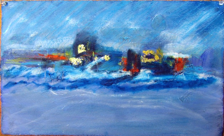
This one begins with acrylic and collage papers on Arches hotpress 140# paper. Unlike the previous acrylic and collage on canvas, this one began with my thinking I wanted to do a seascape instead of a landscape.
The next step is to push back all that collage stuff on the horizon line...
Reinforcing the idea of the seascape...
Now need to add some line work with...hmmm...maybe watercolor crayons or oil pastels? Anyway...needs more oomph at the horizon and a darker sea?
These things do make one think more about composition, value, line, color, etc...but I'm not sure I'm successful yet - more practice to come.
I had a nice watercolor board (Fredrix watercolor canvas on board, 16 x 20 inches) in the corner looking forlorn and not being used. So...used it to do this painting, an abstracted landscape in acrylic and collage.
Acrylics give you the freedom to completely change your mind about shapes
and colors
and line
and...everything!!
You can see that as the painting progressed and changed.
I liked the colors in the beginning painting but they are not "my" colors, so you see things became more blue and violet and yellow as I progressed with adding the collage papers to the horizon line.
And then, it became this!!! What a change. For the better? Not sure. I did like the first and second iterations of this one and maybe got too literal. Or maybe just felt like it should look more like summer?
Live and learn - and practice practice practice. (Sorry the photo is a bit blurry - for some reason, it's harder to get a sharp image when photographing acrylic on canvas?)
This one is finished and is now called
Walk to the City of Flowers
Acrylic, collage and watercolor crayons
on 16" x 20" watercolor board
Darkened the background bricks and the green shadows; warmed the yellow of the shutter and moved from blue to violet to pink in the petals.
Done.
Cannot think of a title other than
Another Hydrangea! ha ha
I think I will do this again in my more traditional way without the line work, although the line work does give it a clean, illustrative look I like for a change.
Next step on this one, after drawing and then going over the drawn lines with the Elegant Writer pens in black ink and bleeding the color out using a brush with just clean water...
I did use a little Potter's Pink on the petals and it granulates well but isn't as pretty a pink as Rhodonite Genuine, so returned to that favorite instead.
I'm sure the Potter's Pink has it's place - here is a photo I took of it on the palette with the Lunar Red Rock (which is what I used to paint the hint of red bricks in the background). Both are a bit gritty in feel when you add water and mix them on the palette. Funny how pretty the tube color is compared to the actual color of Potter's Pink on the paper...
Potter's Pink - top
Moonglow
Potter's Pink + Manganese Blue Hue mixed
fading out to Manganese Blue Hue and
Mineral Violet (Holbein) at the bottom right edge.
It's fun to play with colors and see what they will do.
I drew the next hydrangea painting using one of my photos as reference.
Then I saw Carol King paint pansies using a technique shared by Karlyn Holman on YouTube (see Carol's blog for the painting she did and the link to Karlyn's video).
With this technique, you draw using the black Elegant Writer calligraphic pens because the ink bleeds out into colors when you touch the lines with water.
So I thought, "Well, why not try it with this hydrangea? If it doesn't work, I can go back and do it again with watercolor."
So that's what I did.
This is on a half sheet of watercolor paper but the right edge is cropped off so it is actually
15" x 17.5"
Arches 300# cold press paper
Next step = put the watercolor on after the paper dries. This makes the painting a mixed media painting but who cares if it looks good! I had heard about using these pens before but it was "in one ear and out the other" so it never stuck how I was supposed to use them. I just had them and have always used them for saying in homemade cards :)
The Elegant Writer markers come in many colors - I have some blue ones and a couple of red ones and a brown one...wonder what colors they would bleed out to or if black is the color of choice when using it this way. (You can buy them at an art supply store or any craft store that sells calligraphy materials, like Hobby Lobby or Michaels.)
Nota bene: I did spray mist the paper when I had the shadow colors on by bleeding out the Elegant Writer pens, like Karlyn says will set the ink and keep it from bleeding out - it still bled a bit as I was putting on the watercolor pigment but not too much. Guess I didn't spray enough or leave it long enough?
We finished the flag paintings yesterday in class.
It was not easy getting the shadow shapes and values right to make it look right, but I fiddled with mine for a while and I think it works.
This is on a fourth sheet of gessoed watercolor paper (which helped with the lifting but did cause some bleeding of red and dark in places).
Gluing text onto paper with acrylic matte medium (don't use the gloss medium because you can't get rid of the shine), then painting over that to tone everything down.
These will be cut or torn and used later.
Getting ready to use the papers (tear or cut them into interesting shapes and colors). Using an old flat brush to work the glue (acrylic matte medium) I pour out into a plastic bowl. Have some hotpress watercolor (Arches) 140# paper to use as a substrate. Will paint a background on that, first. Then glue the collage pieces. Looks like a seascape coming up...