Sunday, November 15, 2015

RORSCHACH TEST

November 8th was Hermann Rorschach's birth date.  You know what he was famous for:  the Rorschach ink blot test, those odd blobs of ink on white paper that are supposed to look like something.  It was even mentioned in an early Batman movie (Val Kilmer as Batman seeing a Rorschach on Nichole Kidman's wall) when he said, "Are you into bats?"  And she, being the snarky psychologist, said, "The question is, are YOU into bats?"


Here is one of the original Rorschachs.  In the 1960s, Rorschach's inkblot test was the most prominently used projective test in the United States; it ranked eighth in the list of tests used in U.S. outpatient mental health care.


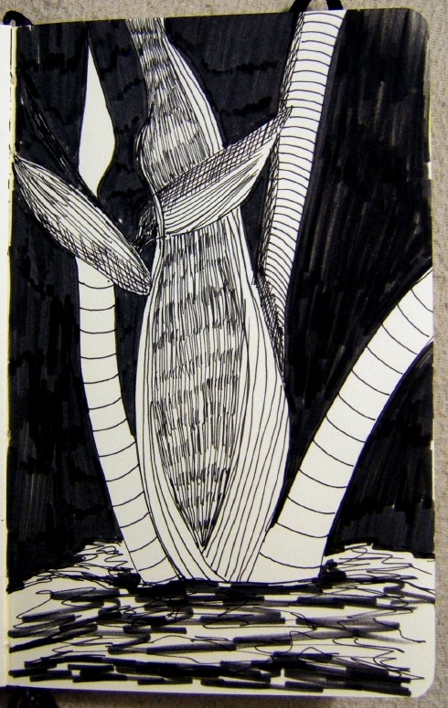
Here is my own version.  Now...I wonder if this has extra meaning because I created it myself?  Hmmm...

I've never played golf, but I see two men breaking two golf clubs over their knees at the bottom of this - now what does that mean? ha ha  You might say, "Why is she doing this?"  But hey, it beats watching another football game.

What do you see?  I promise, I won't judge you.

I have no idea why my type is doing this and can't seem to fix it - sorry!!


Saturday, November 14, 2015

PARIS


Terrorists attack Paris - again.

Friday, November 13, 2015

EEEK! FRIDAY THE 13TH!! AND MORE ALCOHOL INK EXPLORING

Having tried the alcohol inks on Arches hotpress watercolor paper, Tyvek, and Yupo, I've decided Yupo is the only reasonable substrate to use with this stuff.  And since I don't have any Yupo and probably won't buy any, I think the few alcohol inks I bought will remain in a box and be used just for additional elements to other things...unless.  There are some demos in the book, Pigments of Your Imagination, that use tar gel and even glue over paper...might try that before giving up on these.


Until then, 
here is Sweetie's experiment on glossy photo paper with a background printed on it (4 x 6 inches), 
and a jellyfish on a small scrap of Yupo.


He gave up after a few tries, saying it was more fun to watch me work with it than do it himself :)


So I worked with a few colors on scraps of Yupo (mostly the Yupo has the remainder of bad paintings on it, front and back, but you get the idea).

When the ink dries, it seems to be permanently stuck on the Yupo but I haven't tried to remove it using rubbing alcohol yet.  


This is the only one I liked - but it's still just abstracted playing with colors and seeing what the inks will do.


Have you ever tried the alcohol inks?  What did you think about them?


Wednesday, November 11, 2015

I THANK YOU


I didn’t have to go
Because you did.

I could stay safe at home
Because you went.

I didn’t have to bleed
Because you did.

You hid your scars from me
Because you could.


Because you went,
Because you could,
Because you did,

I thank you.

ALCOHOL INK EXPLORATION

Using the book, Pigments of Your Imagination (see last post), I went through a few descriptions and tried my hand at different papers.

The alcohol inks don't smell strong but the smell does linger so make sure you air out the room a bit while working or after...


Tried a test color on:

Arches hot press - soaked right into the paper like a blotter = no good

Tyvek "paper" = also soaked right into the paper like a blotter = no good


Then tried putting the inks down on TerraSkin directly and on a styrofoam plate and "printing" the image onto the TerraSkin (just made a blob - a pretty blob but still just a blob).


Putting it on TerraSkin directly, it smooshed and softened a lot.


More experiments to come...so far, nothing special for me in this medium so maybe just a toy to add to something sometime...

Monday, November 9, 2015

NEW TOOLS/TOYS


I missed the September program of the Greater Cincinnati Watercolor Society when the member, Louise Allen, demonstrated how she works with alcohol inks.  So...it got me thinking about them and I've seen some online folks use them.  Looks messy and uncontrollable and worth a further exploration.


So I bought a book that teaches you the techniques (Pigments of Your Imagination by Cathy Taylor).
And I bought some alcohol inks from Cheap Joes.
And I was ready to go...

The colors are intense and saturated and people mostly use them on slick Yupo or TerreStone "paper" to play with the uncontrollable aspect of them.  The colors are prettily named like:  Mermaid, Clover, Sailboat Blue, Sunshine Yellow, etc.  You are supposed to mix, water down, and work with them along with rubbing alcohol (the book says 95% although the regular stuff you get in the drugstore is 75%).  And make sure you aren't standing over your workspace breathing in the fumes - this is stuff that can harm your lungs if you don't get enough air circulating around you.

I'll share some explorations later...I'm going to try them on glossy photo paper, Yupo, TerraSkin and hotpress watercolor paper.  Since these are teeny tiny bottles, I hope a little goes a long way!


Saturday, November 7, 2015

MESSING UP CLEAN COLORS AND LINES


This was a painting that was too clean, too uninteresting except for the color on the birds...so I went in and messed it up, creating some movement and some mystery?  


Flamingo Pair

Friday, November 6, 2015

CINCINNATI ART MUSEUM


Sweetie and I went to the Cincinnati Art Museum over in beautiful Eden Park yesterday.  It was a gloriously golden autumn day (even though it's November, Mother Nature seems to have stalled in warmer than usual days and sunshine).  We went, specifically, to see the photographic exhibit of Jochen Lempert, a German photographer who started his career as a biologist.  Since Sweetie is a biologist who is also a photographer, I thought it would be interesting.

It was interesting.  Lempert still uses only film cameras and prints his own prints in black and white on some kind of grainy paper.  So nothing was sharp with high contrast (things Sweetie loves).  There were some lovely pieces, some interesting pieces and some pieces where Lempert was just playing around, experimenting with "what ifs" like the one of the glowworm moving across the photo-sensitive paper in a darkroom, creating a trail of lights.  


All of the photos were unmatted and unframed - just the photo paper taped to the walls.  I thought it would look unprofessional, but there was something very interesting in the starkness of the rooms (three rooms devoted to his work, and there was no extra charge).  


You were probably not allowed to take photographs of the work, but they had a free booklet that included many of his works you saw on the wall.  


Thursday, November 5, 2015

WORKING ON SOME UNINTERESTING OLD PIECES


Pulling out old paintings that were finished but not interesting...and throwing paint, lifting off, changing, etc. 

The goal is to have something interesting.  Would this make you walk across a room to look at it more closely or would you just glance over it and move on to the next painting on the wall? 


Caw Girl:  Gossip Birds


Tuesday, November 3, 2015

WORDS OF WISDOM AND A REVISION

Some Sunday thoughts by Ira Glass, host of This American Life:
“Nobody tells this to people who are beginners, I wish someone told me. All of us who do creative work, we get into it because we have good taste. But there is this gap. For the first couple years you make stuff, it’s just not that good. It’s trying to be good, it has potential, but it’s not.
But your taste, the thing that got you into the game, is still killer. And your taste is why your work disappoints you. A lot of people never get past this phase, they quit. Most people I know who do interesting, creative work went through years of this. We know our work doesn’t have this special thing that we want it to have.
We all go through this. And if you are just starting out or you are still in this phase, you gotta know its normal and the most important thing you can do is do a lot of work. Put yourself on a deadline so that every week you will finish one story. It is only by going through a volume of work that you will close that gap, and your work will be as good as your ambitions. And I took longer to figure out how to do this than anyone I’ve ever met. It’s gonna take awhile. It’s normal to take awhile. You’ve just gotta fight your way through.”


Sometimes I think, "Why do I continue to struggle with this feeling that I can be better when I could just quit?"  Do you ever feel that way?  

Revised 
La Rouge
watermedia on half sheet Arches (15 x 22 inches)

I guess the best thing is to just not quit.  Just keep working at it, going on, getting a little better each time you try.  I am soooo much better than I was when I began this journey but sooo much farther away from where I want to be.  So...keep on working at it (and stop whining when it gets hard).  But sometimes you just want a piece of pie and hot cup of coffee and a good book :)

My goal is to create pieces of work that evoke feelings - good or bad - but not indifferent!!  I don't want someone to look at my painting and say, "Wow, that must have taken her a long time to paint that."  That, to me, is not art.  I really want to convey something of myself - you know, we all have something inside ourselves that is ours alone.  I think my "something" is trying to break out - or maybe this is just a phase I'm going through!  Time to spend some time cogitating and asking hard questions about what my work means to me and what I want it to mean in the future.  I only have another 25-or-so years to go (if I'm lucky and stay healthy) in order to get where I want to be!


Saturday, October 31, 2015

SOMETHING DIFFERENT


La Rouge


Watercolor on half sheet (15 x 22 inches) 
Arches 140# cold press paper


Just breaking from the flowers and plants for a minute or two.  

Give me an honest opinion, please.  I didn't get much feedback when I showed this to my students so I think they didn't like it or didn't know what to think of it.


FYI, I started this a long time ago and put it aside - didn't know what to do with it or where it was going.  It was from a photo I took while watching something on t.v. but I can't find the photo now so I just pulled this mess out and started messing with it.  Yes, it's a mess.  Yes, her little thin arms and hands are tiny compared to her full figure.  So...the uptilted head and reds I like.  The arch in black and curves around (but cannot be easily seen = a mistake).  

What else?  What would you change?  Or would you just put it in the round bin with the others done lately?

Friday, October 30, 2015

INKTOBER IS ALMOST OVER


Inktober is almost over and here is my last set of doodles...


This was in color in a sketchbook, so I added the ink around the color to come up with this silly bird.


A display of art genres on the page - with an additional bit of this and that thrown in! ha ha  Sometimes I wonder about my mind and how it works.  (Need more cowbell???)


Scribbles the Dog?  
And fields of something.  
With a woman who has a tree growing out of her head.  

Please don't try to analyze me!  It might be scary!! ha ha

Thursday, October 29, 2015

IN A RUT OF OVERWORKING PAINTINGS


Not sure why, but I seem to be overworking a lot of paintings that get torn and sent into the round bin (or used for scrap paper on the backs).  

This began okay but the water looked muddy to me so...I mixed up a large batch of cobalt teal blue and just poured it over the whole thing (while the flower and pad were masked off).  Did this until I got a prettier loot to the water.  

The lily pad at the top left has watercolor paint and watercolor crayons on it.  The lines need more color (they are underneath the water).  I like the purplish color of the stem and shadow (and I did crop off some of the bottom so I don't have a full shadow of the flower there).  


So...how could I go wrong?  Well, apparently pretty easily!  Because when all the masking fluid came off and I began on that flower, I just kept putting pigment on wet on wet and let it run and didn't have any indication of segments and...just kept doing it!!  I think my problem might be lack of attention to the painting because I'm watching things on Amazon Prime while I'm painting and maybe that it not a good thing!

Trust me, this one looks better here than in person where it's a mess!  (Went in with watercolor pencils and drew in the separation between petals and there is nothing delicate about it.)  The only good thing about it is the water.

So...another sheet of paper, another start...


Tuesday, October 27, 2015

INKTOBER DOODLES - A FEW MORE


In the Moleskine sketchbook (I used all the pages in the last sketchbook and put it on the shelf with the other used ones).  Have a few pages in this sketchbook before it's filled.


Put an acorn (from a bowl) on the arm of the sofa and sketched it (had a deep shadow shape I liked).

The other is just an imaginary doodle that became a wooly worm (caterpillar)! ha ha


And this is inspiration from our recent Penguin Encounter at the Newport Aquarium.


This makes 12 sketches...need to do a few more to catch up to the date if I'm to have one each day done (or maybe I'm on a one every day schedule...yeah, that works!)


A mishmash of doodles...a caramel apple, a pumpkin, a faded flower, a feather, other whatnots.  If I count each one, I'm at 21 now! ha ha


Doodle number 22?  But still behind...

Sunday, October 25, 2015

COOKED GREENS


Well, I worked on some value changes (getting darks here and there and more pop to the painting).  I still don't care for this, even though I cropped off the busy left side that did nothing for the painting.  

Sometimes you win...sometimes a dog is still a dog!  Maybe I still have problems with greens?


So put this aside and began on a water lily painting from a photo Sweetie took.  I wanted it to be soft, serene, pale...


But I'm in a rut of mistakes and overworking, it seems. 

I ruined this one so badly I just tore it to pieces and it went in the round bin for all time.


And I began again...with a single flower...on a smaller sheet of paper...


Friday, October 23, 2015

GREENS


Since I did all those Plant Life series paintings, I've felt like playing with greens. The background top and middle done.  Going to paint each element as a cell = wet just the element (leaf, branch, etc.) and paint that, step by step.

This is a fourth sheet, Arches 140# cold press paper.


More color - but definitely needs more variety in the values to get this one to look okay...

I don't know what this is - something growing on the top of a cliff on San Salvador Island, Bahamas, the last time I was there.  Yellow-orange round fruit and white flowers all on the plant at the same time.  


I wonder if any of it is left after Hurrican Joaquin ripped the vegetation off the island (so much so that birds are without nests and food and are so disoriented, they are flying into windows and vehicles :(   It is still a long rebuilding process for those people living on San Sal although we won't hear about that here, in the U.S., at all.  


Wednesday, October 21, 2015

MORE INKTOBER DOODLES


Just a few more ink doodles while celebrating and participating in Inktober 


Would you like to be a mermaid, swimming in the sea?


Or would you rather be a fire-breathing dragon?


I gave my love a cherry...


I see it's past the mid-point of October and I only have about a dozen Inktober doodles done...behind, as usual.  I need to find a new small sketchbook to do more...

Monday, October 19, 2015

PENGUIN ENCOUNTER AT THE NEWPORT AQUARIUM


Sweetie and I went to a program/talk by a marine biologist given at the Newport Aquarium a few months ago and Sweetie is so lucky, he won a Penguin Encounter.  What is a Penguin Encounter?  It's where you go behind the scenes and get up close with the penguins and hear what they are all about.  Since Friday, October 16 was a day all three grandkids were off school and their mother could get the day off, too, we went!  A big group of 7 of us, but the penguins didn't think it was too many.


And it was a great experience.  Allie, the animal husbandry employee, gave us the little tour and lots of information, telling us many facts about the African Penguins (also called Jackass Penguins because they make a braying sound just like a donkey and it wasn't long before we were hearing that sound!!).  She answered questions and told us about her many trips to research and study penguins and other animals. 

Being introduced to Blueberry, Red Pepper, Green Bean, Sandy, Speckles, Randi, and Simon (those are all I can remember and I don't know how long it would take a keeper to remember whick bird was which - but they do have colored tags on their flippers to help with identification).


You really can't help laughing when they make their donkey braying sounds to get attention from Allie!


Allie took our photo with two of the penguins - I think it was Simon and Sandy?


Although some of the penguins have male names (Randy, Simon), the African penguins at the Newport Aquarium are all females.  This is because they don't want captive breeding in the group due to the genetic pool these sister and cousins are in.  When a male from another zoo or aquarium is ready for a mate, one of our females will go on a date with him and see if they get along :)  Because these are endangered creatures, they want to keep the gene pool "flowing" and not interbreed.

Thanks, Allie, for a great time!!  

After the program, we toured the Aquarium, taking our time and letting the grands do whatever they wanted to do; then  a walk across the plaza to lunch at Dewey's Pizza - yum!  And walking around Newport on the Levee was great because it was a gorgeous fall day on the river! 


Saturday, October 17, 2015

OWS SHOW AT MIDDLETOWN, OH

Sweetie was my chauffeur Thursday morning, driving me up north to Middletown, Ohio to see the Ohio Watercolor Society show at the Middletown Art Center.  It's a beautiful venue with a lovely gallery setting for the show.  Unfortunately, they were setting up for a private event and had pushed some of the middle "walls" back into the "real" walls so there were a few paintings you could not see at all!  How silly!

Anyway, I (as usual) did not agree with the major award winners and chose to walk around a couple of times and snap what caught my eye and then a slow go around to choose my own favorites - it's too bad I am never asked to judge, I would really shake things up!! ha ha

So here are my top picks:


Earth Song 
by Billie Richards
of Kirtland, OH
won an OWS Award of Excellence


but I would have given this painting top place.  Because it is watercolor in bits that are stitched together like a watercolor quilt (it's paper, not cloth), and there was so much interesting texture and visual interest, not your usual watercolor painting at all!

(Sorry about the reflections in some of the paintings - it could not be helped.)


Detail of the above painting to show the stitching (in gold thread) with gold acrylic marker in places to carry on the painting, etc.  

This was a beautiful painting.


A Time to Reap
by Christine Misencik-Bunn
of Fredericktown, OH
won the OWS Award of Distinction

but, again, I would have given this second place overall.  It was pure, transparent watercolor, and it was masterfully done.  There was so much depth in the darks - and that sky and the man's teeshirt!!


Heart Break Falls
by Sally Emslie
of West Lafayette, OH

I don't know why this very inventive and visually imaginative painting did not win an award.  I would have given it third place.

It was not pure watercolor (I wish the artists had to name their media on the title card because you can paint in watercolor, gouache, casein, acrylic, etc. for the show - and paint on gessoed paper, yupo, canvas, etc.), so I assume it was acrylic with gesso (?) to create the wonderful texture you cannot see in this photo.  That flowing waterfall is all white gesso flowing down into the water...really a good painting and clever.


Eleanor's Barn
by Gary Brooks
of Amelia, OH

Another masterfully painting pure watercolor with tons of texturing in the wood and window to draw you in - which didn't win anything.  I would have been in my top 5.


Egret II
by Sharon Eley
of Chillicothe, OH

This was a delicate, beautiful, romantic image of an egret surrounded by loving half-scenes.  Loved the colors used and the delicate touch of the artist.

Definitely in my top 5.  And I found the hanging of this one (high up so you had to crane your neck to see it and could not look closely), unfortunate.  


More of my favorites:


Just Incredible
by Phyllis Lawicki
of Cleveland, OH

A brightly colored, highly textured, piece that was very eye-catching whether you were close to the painting or across the room.  Everything flowed well in this one.  


Quixotic
by Robert Moyer
of Rocky River, OH

I loved the creativity of this one - clever, fun, and well painted in an unusual way.  Very appealing!


If you get a chance and are in the Middletown, OH area, stop in and see the show and tell us your favorites!