Friday, October 31, 2014

A BIT MORE ON THE POURED PAINTING AND CLASS


Class Tuesday consisted of just one student - so she got personalized attention and seemed to enjoy it and get more done!  

And she learned a bit about the difference between transparent and opaque pigments and how to test them:  

Take a black marker (permanent, waterproof), and make a line down your watercolor paper.  Mix your color/pigment with water and paint a swatch over the line.  If the color dries and you can see the black marker line perfectly = transparent color.  If the color dries and you can see the pigment cloudy or chalky over the black marker line = opaque.  She tested several yellows and blues, and a few reds to choose her primary colors for her first pours.

I painted more on my berries and leaves after she left, but they are looking stiff to me.  Not very pretty and, at this point, I think I would have to go in with fluid acrylic to get the berries to pop.  Probably won't do more to it, though.

AND HAVE A VERY HAPPY HALLOWEEN!


Wednesday, October 29, 2014

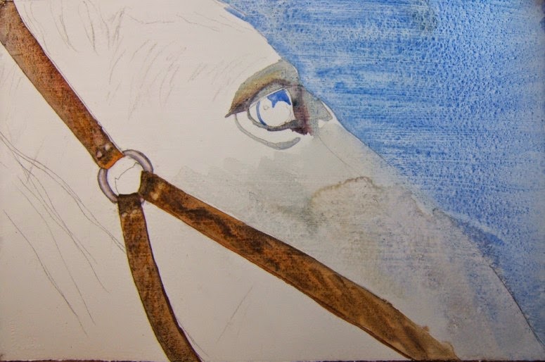
WATERCOLOR ON ACRYLIC MATTE MEDIUM TREATED PAPER - ALMOST DONE


He's coming along.  
I still need to soften a few edges.  What do you think?  Putting the acrylic matte medium on the watercolor paper (140# hot press) makes it sturdier, heavier and more stiff - but you can wipe back your colors if you don't like them (or if you lose your whites and want to lift more).  I can see the pros of this technique.  


But I would still, for myself, want to learn to leave those whites on pure watercolor paper without resorting to gesso or matte medium on the watercolor paper - although I do like the textured look you can't get on pure watercolor paper - perhaps I'll work on some hot press alone and see how that works out to get some texture...always trying to find the perfect fit for myself.  Plus it's always fun to try new things, see what they offer you, and either use them or move one.  


The image is stronger when I crop it to focus on the eye and just a hint of the bridle...may do that if I ever mat and frame this one.  What do you think?


Monday, October 27, 2014

WATERCOLOR ON PAPER TREATED WITH ACRYLIC MATTE MEDIUM


I found an old photo of a white horse taken during a trip to Shaker Village in Kentucky for my reference.  And began the painting with the background blues and then the bridle.  I like the way it separated and created some nice texture on the bridle.  Using just a pale wash of raw sienna + cobalt blue for the greys in the horse for now.  (The blue bled into the white at the bottom right edge - the nose should be coming outwards here, not in - will fix that).


Here is a closer look to see how the watercolor acts over the matte medium.


I will paint a bit more on this to finish it and get that eye really dark and shiny.


So far, I'm not noticing any difference in this technique than when you put white gesso over the watercolor paper and then paint in that = easy to lift and some texture on the paper and it does make the paper heavier (I used Arches hotpress 140#).  Except the white gesso does leave a chalky look and this doesn't.  As with all these techniques, they've all been done, I'm sure - and are just ways to make it easier to paint in watercolor because with them you can lift back to white (if you use nonstaining pigments).  I don't think I could get that look to the bridle by just painting straight watercolor on plain watercolor paper, though - maybe if I used hotpress?

Back to the poured paintings in class tomorrow.


Saturday, October 25, 2014

INTERESTING TECHNIQUE


While reading the latest Watercolor Artist magazine, I came across this artist, Kitty Burris Schachter.  

She covers her watercolor paper (hot press) with acrylic matte medium before painting watercolor on it.  I got a sheet prepared with matte medium and will see how this works.  Now to choose something to paint on it.


I have a feeling that it creates a smooth surface from which she can easily lift color (she also says she uses nonstaining colors in order to do this).

Isn't that a lovely white horse?

You can find her webpage here, if you're interested in seeing more of her work.  


This is what she says in the article.


I'll let you know when I choose something to paint on this - I guess it should have lots of whites and lights (so not a crow!).

Thursday, October 23, 2014

A BIT MORE WORK ON THE POURED PAINTINGS


This one is done.  Just darkened a bit around and under the dolphins.  They look a bit too cute, but that's okay - you get the idea.


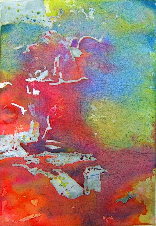
This one is going to take a lot of time and patience to get it looking right and figure out how much whites to show, how much more greens, leaves and berries to get it to work.

The drizzled and sprayed masking fluid is what causes the organic, viney look of the whites left white so far.

Tuesday, October 21, 2014

NEXT STEPS IN POURED PAINTINGS


I poured two layers of color on the dolphin painting and then removed the masking fluid.  To finish, I'll darken a bit underneath the dolphins and in the lower part of the painting and call it done.  Only three colors used = Cobalt Blue, Ultramarine Turquoise, Cerulean Blue
I left a lot of white and flipped color on from a round brush to get the diagonal shapes of color here and there.


In this next one, I poured and dizzled and sprayed the Pebeo Drawing Gum all around the paper, then chose something to draw on the paper = American Beautyberries and leaves with vines.  Drawing on and some things to paint from here (won't do more pouring on this one.  (All of the grey color is the masking fluid still on the painting - which I won't remove until I paint in the leaves and berries.)


The students will be back next Tuesday to work on their paintings.  Since we only meet for 2 hours at a time, this will probably will take them 3 weeks from start to finish.


Sunday, October 19, 2014

REAL LIVE MERMAIDS


The Newport Aquarium (yep, it's in Newport, KY), has given the local folks a real treat - the famous Weekie Watchie (FL) mermaids came for a visit.  They spent 2 weekends and a full week entertaining and amazing the people who came to see them.  Sweetie and I went on Columbus Day (Monday) and it was packed with parents and little girls, many of them holding their own mermaid dolls - wide-eyed and amazed at the lovely mermaids swimming in the Coral Reef exhibit.


Here are some photos Sweetie took of the lovely mermaids of Weekie Watchie Springs in Florida.  He says he and his brother saw them when he was about fifteen years old. 

They were in a tank that has stingrays and other fish in it so even some of the critters were curious!


This little fellow was thrilled and I know he wanted her to pick him up but couldn't figure out how to get that glass out of the way!


Six different mermaids came to entertain the OH and KY visitors.


Besides the mermaids swimming in the tank, a mermaid was high and dry, waiting for people to have their photos taken with her.  


Since they are down there for 1/2 hour, they have their own breathing tube to use, as needed.


I like that blue tail - wonder if I should get a mermaid costume for Halloween? ha ha)


Although the Coral Reef tank is not really big, they did go from side to side over the "tube" people can walk under and they did a few flips now and again.


Friday, October 17, 2014

TUESDAY THROUGH THURSDAY

I got everything together over the weekend in order to show my students how to do a poured watercolor painting in Tuesday's class.  And, as usual, forgot to take a photo of the work the students were doing!  But here is what I shared with them:


1.  The first poured painting I did in a class long long ago was too pale so I showed them how you could go back in and darken using your usual techniques with watercolor pigments, water, and your brushes.  I darkened this a lot.  And then didn't like that I didn't leave whites like I should, so put white gouache on some areas.  Won't do anything with this (it was the teacher's photo, not mine, and I don't like it much, anyway!), but it did show them they don't have to worry about getting those deep darks in until the end (less pressure for them as they do their pours).


2.  Another beginning (they already saw the finished statue painting and liked it), using simple shapes of 3 dolphins.  Won't do anything more with this when it's finished because the design belongs to an old blogger Yahoo groups friend, who once sent me a card like this.  This idea showed the students that they don't always have to use the three primary colors of yellow, red and blue, but can choose a variety of color combinations for their poured paintings.


3.  And another beginning, showing the students that you can just do your pour and drizzle the masking fluid (pushing it with a sprayer of clean water) in an organic way before even thinking about your drawing or what you want to do.  This one looks to viney that I will probably do berries and leaves and vines on this one.


As with any technique, you can experiment, choose what you want to do, pick your colors to suit yourself, etc. ---- it's your painting!


Things besides art kept me busy Wednesday and Thursday, and today I have to read and enjoy my latest Watercolor Artist magazine...

So maybe some painting done this weekend?


Monday, October 13, 2014

GOUACHE + INK GOLDFINCH FINISHED


After the India Ink dries completely, you take a sprayer and wash everything off - the ink and the white gouache.  You can do this outside with a garden hose, under the sink with the kitchen sink sprayer, or in a tub of water (which you have to change about 3 times because it gets grey and yucky pretty fast).  Any way you choose, wash off all the ink and gouache you want, leaving some ink behind (or a lot, depending on your preference).


And then you have this.
The white gouache has allowed the white of the paper to show through and the India Ink has gone into all the areas you left without gouache, making a nice print-like painting.  (I used Daler Rowney white gouache on this one, something I had leftover in a tube; and the white after everything was washed off was a dull greyed color - so I think Winsor Newton gouache gives the best result if you want your whites to be clean and bright before putting color on at the end.)

At this point, you can leave it like this, or go back with your watercolors and paint in some color.  (You want to make sure the paper is dry before painting on it and that may take a while since you're using 300# paper and it's pretty soaked after washing off all the gouache and ink.  So I'd give it another 4-5 hours to dry.)


When my paper was dry, I went back with my watercolors and gave the goldfinch some color, even in the background area (a pale wash of brown from a mix of 3 primary colors).


I hope you enjoyed the demo and will give this a try.  It's really easy.  It just takes time for each layer to dry.  If you don't like waiting, you could work on 2-3 of these at a time.  

Saturday, October 11, 2014

GOUACHE + INK GOLDFINCH STARTED


Here is the gouache + ink resist technique, using just white gouache and black ink as the first steps.


Using a photo of a male, juvenile goldfinch (you can tell he's young by how scruffy he looks), I sketched it and then traced the sketch onto 300# cold press watercolor paper (Arches).  Heavier paper works better with this technique but you can use 140# is that's all you have.


Next step = using a small round brush and a 1/2" flat brush, I painted on the thick white gouache (the gouache goes all around the outside of the subject, too, but leave a small area around the outside of the paper (which will become a nice "frame" for the painting).

In this photo, I hope you can see the texture of the gouache all over the paper.  I did go back in and redraw some of the lines with graphite pencil so the lines will hold the black ink in the next step.


Next = Using your cheap brush from the hardware store, lay down a wash in as few brushstrokes as you can, with the undiluted black, waterproof India Ink.  Don't brush over and over or you'll lift the gouache!

I put an old towel beneath the painting to catch any excess ink, and then left it to dry - about 4-5 hours should do it.  You will know when you return and you see no trace of moisture in the ink layer and can see a hint of the subject underneath.  

Next = see next post for the big reveal!


Thursday, October 9, 2014

THE ANGEL STATUE AGAIN USING COLORED GOUACHE + INK


For the gouache + ink technique, I took the angel statue photo and sketch and traced it onto a piece of 300# cold press watercolor paper (I think it's Arches but I use Arches and Fabriano interchangeably so could be Fabriano).  It helps to have a heavier paper for this technique.

Anyway...


Using colored gouache as the "resist", and wanting greyed colors for the statue, I put out Winsor Newton Primary Red, Primary Yellow and Primary Blue on a large palette (so I could mix them, as needed), and filled in the lines with the three colors.  (In this photo you see Burnt Sienna, as I originally thought I'd use it, too, but ended up with just the 3 primary colors.)

Painting with thick gouache right out of the tube (only wet your brush to get the gouache to move but don't think down the gouache), I brushed the colors on in all the areas I did not want white or black (remember the ink will show wherever you do not have gouache).  If you want any area pure white, use white gouache to cover that before doing the next step!  I did want white areas in the final painting, so got out some Winsor Newton white gouache and added it to those areas I had not covered with the primary mixes.

After the gouache dried (about 5 hours), I used an old household brush (pick up at any hardware store), and brushed on a single layer of black, waterproof, India ink and let that dry.  

When the ink had dried, I was ready to wash everything off and see what I had.  You can go outside and wash it all off using a garden hose, you can wash it off in the sink using and kitchen sprayer, or you can just wash it off by submerging it into a tub of water and gently brushing away the gouache and ink with the same household brush you used to apply the ink (make sure you washed that ink out well before you do this or you're just brushing ink around!).  


When you have enough ink off the painting, you end up with something like this - which looks like a print.  I left more of the ink on this one than in previous ones I'd done because I liked that it added to the rough texture of the statue and gave some dimension to the greenery in the background.

I first heard of this technique in a Val Webb online course.  She used just white gouache and black ink and then painted in what she wanted with watercolor after everything was washed off and had dried.  I liked that, but I searched around and found some artists using colored gouache and wanted to try it.  It takes a bit more thinking when using colored gouache so you leave enough lines and spaces in the final covering (where the ink will settle).  If you do get carried away and cover an area with gouache, you can always "cut" back into it with a sharp pencil to get back to the lines you covered.

What do you think?  Ready to try it?  
All you need are 4 tubes of gouache = yellow, blue, red, white; heavy watercolor paper or watercolor board, a bottle of waterproof (important that it's waterproof), black India Ink, a small brush for painting on the gouache, a rough household brush for painting on the India ink, a place where you can spray or brush off the dried gouache and ink and you have it!


Tuesday, October 7, 2014

LAST STEPS OF THE POURED PAINTING


After the first 3-color pour dries, you can see if you need to adjust color or darken any areas.  And do another 3-color pour, using the pipette filled with watered down pigment to direct the colors into the areas you want.  Let the run-off pour into your container and dispose of that (it will be a muddy brown color from mixing the 3 colors).

Let that dry and then, if you have what you want, remove the masking fluid (remember, all that grey stuff is masking fluid and all those areas will be white and hard-edged on your painting).

So...do you want a lot of hard edges?  No?  Then take a nice scrubby brush (lots of art supply stores have them and I think Cheap Joe's calls his Fitch Scrubbers).  The brushes are just short, hard-bristled brushes.  Go easy on the paper, here, or you'll scrub off a lot of the paper!

Prewet the edge you want to soften by just dropping a small drop of water along the area from the scrubby brush, wait a few seconds and then gently scrub away the color a little, working on small areas at a time - don't scrub on your paper if the area is dry because it will scratch the paper.  


After you do this, it is almost impossible to go back into that area with paint - it will look bad and rough.  So...make sure you want those softened edges where you want them.

And then - you are done!
The finished painting with a lot of edges softened.

Hope you try this and have fun with it.  You really only need a little paper, 3 tubes of color (yellow, red, blue), some masking fluid, a pipette to direct the colors, and a tub to contain the overflow while you're pouring.  

Enjoy!

Sunday, October 5, 2014

IT'S RAINING SO LET'S POUR

My students are interested in learning how to pour watercolors to complete a painting, so I had to go back and do one (it had been a loooonnngggg time since I'd poured a painting).  This is a fun way to get a watercolor painting without even using a brush!  I know most of you have done this at least once in your artistic life, but here are the steps (in case you want a refresher or are new to the idea of pouring your watercolors on your paper).


First choose a good photo that has a strong value pattern = very strong darks and lights.  I used this very old template from a photo of a cherub statue holding a plate of doves (gosh, I hope that cherub is not one of Dr. Who's angels who will eat the doves as soon as we close our eyes!!).

I traced the photo onto a fourth sheet (11 x 15 inches) Arches 140 lb. paper.  Then I masked out all the areas I want to leave white in the final painting, using Pebeo Drawing Gum (it's a grey color so I can easily see where I've masked).


While the masking fluid was drying, I chose the colors I wanted to use on this painting = the primaries of yellow, red and blue.  I chose Hansa Yellow Light, Quinacridone Red and Cobalt Blue for my beginning colors.

Putting about 1 inch of pigment from the tube into the little glass jars, I then added the water (just enough to mix the pigments into a watery mix).  You want to use a brush to mix the pigment and water so you don't have globs of paint coming out onto your painting when you pour your colors, so mix well and thin the pigments down to a nice, watery consistency.

By the time you do this, your masking fluid should be dry.  (Don't pour any color until the masking fluid is dry.)

I've been told to always start with the yellows in your palette because putting a color over yellow works well but putting a yellow over another color does not allow the yellow to glow as much.  So, I began with pouring on the yellow.


Since I am using a small sheet of watercolor paper here (I would normally paint on at least a half sheet), I used a plastic pipette to drop the color onto the paper at this point.  You can get eye droppers or plastic pipettes at any hobby store or even drugstore, I imagine.  

BUT FIRST, 
lightly spritz water onto the paper so you are not pouring onto a dry surface.  This helps the color move.)

Direct the yellow where you want a nice yellow glow in the painting.  While this is still wet, pour on your red or blue (doesn't matter which goes next), and let it bleed into some of the other color already on the paper.  Pour all three colors this way, allowing the color to run off the sides of the painting (into a towel or into a large tub you have on your table).  When you get all three colors the way you want them, stop and let that dry completely.  

Come back later to see the next steps!


Friday, October 3, 2014

MY NEW MERMAID CUP


It took me a few days (have had much to do besides getting into my art room), but I finally painted my new Mermaid Cup from Starbucks.  Pretty! 

I did this in my Strathmore Visual Journal (90# cold press paper).  I have two of the 140# paper journals, too, and really like them.  They are all wire bound and 9 x 12 inches.  A good size for making small paintings and sketches.


Hope you all have a wonderful, fun and relaxing weekend!

Thursday, October 2, 2014

GCWS PROGRAM BY SUSAN GROGAN

Our monthly meeting of the Greater Cincinnati Watercolor Society was held yesterday morning.  One of our members, Susan Grogan, gave the program and demoed her techniques for creating texture in her watercolor paintings.  Susan is a good presenter, very at ease and no awkward silences.  She teaches watercolor classes Fridays at Hobby Lobby in Eastgate and Mondays in Milford, OH.


Susan had several examples to pass around the room for us to see up close (she uses salt, salt + water, and just water to make the textured spots on her pottery; and also uses granulating colors).  She said she's never had a problem with the salt eating through the paper since she's been using it.  She also starts each of her works with a small thumbnail value study or a color study in a monochrome color.  This gives her an edge on working out problems of composition and value before she begins her final painting.  


She started with a drawing and did the rusted turquoise jug, then the sunflowers (she's known for her yellow flowers and used 5 different yellows in them, including Lemon Yellow, Raw Sienna, New Gamboge, Yellow Ochre and Quinacridone Burnt Scarlet for redder spots).

She almost completed the painting by the time the 12:00 o'clock whistle blew (which it does every first Wednesday of the month at noon - a test of the tornado system warning sirens and it is LOUD).


It was a good program with a fun and interesting speaker.  
Thanks, Susan!!